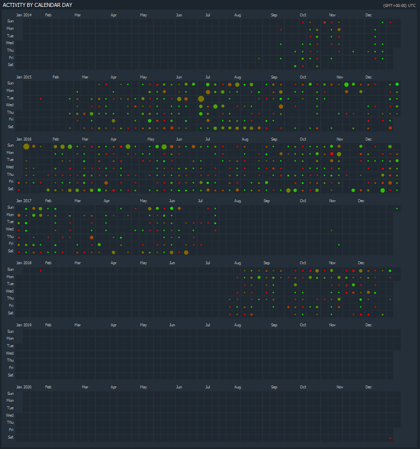
35
submitted 1 year ago by t0fr@lemmy.ca to c/dataisbeautiful@lemmy.ml

My screenshot of my Dota playtime over the years from Dotabuff.com Size of the circles represents how many games were played that day. Colour of the circles represents the win/loss ratio for that day

top 3 comments
sorted by: hot top controversial new old
[-] nero@lemmy.world 1 points 1 year ago

i thought this was github

[-] BillMurray@lemm.ee 1 points 1 year ago

The sound of hundreds of Dota buff users wishing they’d posted this themselves echoes throughout the fediverse…

[-] t0fr@lemmy.ca 1 points 1 year ago

haha I didn't even rush to get this out. Just casually strolling through my screenshot folder

this post was submitted on 07 Jul 2023
35 points (94.9% liked)

Data Is Beautiful

5773 readers
1 users here now

A place to share and discuss data visualizations. #dataviz


(under new moderation as of 2024-01, please let me know if there are any changes you want to see!)

founded 3 years ago
MODERATORS