this post was submitted on 23 Jul 2023
747 points (92.5% liked)
Data Is Beautiful
7228 readers
7 users here now
A place to share and discuss data visualizations. #dataviz
founded 4 years ago
MODERATORS
you are viewing a single comment's thread
view the rest of the comments
view the rest of the comments

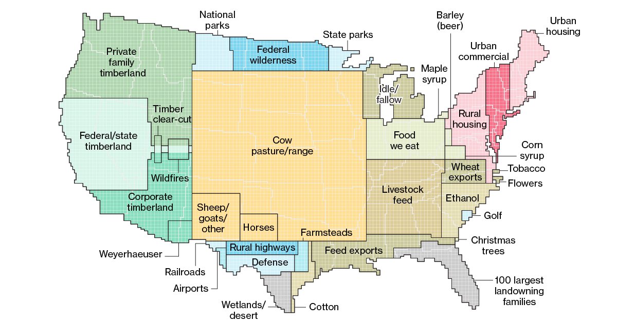
That makes no sense for Michigan at all. I’d imagine Michigan land use is mostly forest (so much national forest/protected wetlands here), then agriculture, then urban space (Metro Detroit is most of this), then a little pasture. The only way “idle” makes sense to me is if any protected forest/natural land is considered “idle”
But it's clearly not broken down by state. Surely it would be nonsensical to put all of airports in the country in a giant square in southern Texas, right? That's not what this map is intending to say.
I know this map isn’t clearly broken down by state, which is (part of) why this map struggles to communicate what it’s trying to say IMO. I think the first map in the linked Bloomberg article (with land use data broken down on a more granular level) does a better job at communicating the same trends