this post was submitted on 25 Apr 2024
1137 points (97.6% liked)
People Twitter
5226 readers
3220 users here now
People tweeting stuff. We allow tweets from anyone.
RULES:
- Mark NSFW content.
- No doxxing people.
- Must be a tweet or similar
- No bullying or international politcs
- Be excellent to each other.
founded 1 year ago
MODERATORS
you are viewing a single comment's thread
view the rest of the comments
view the rest of the comments

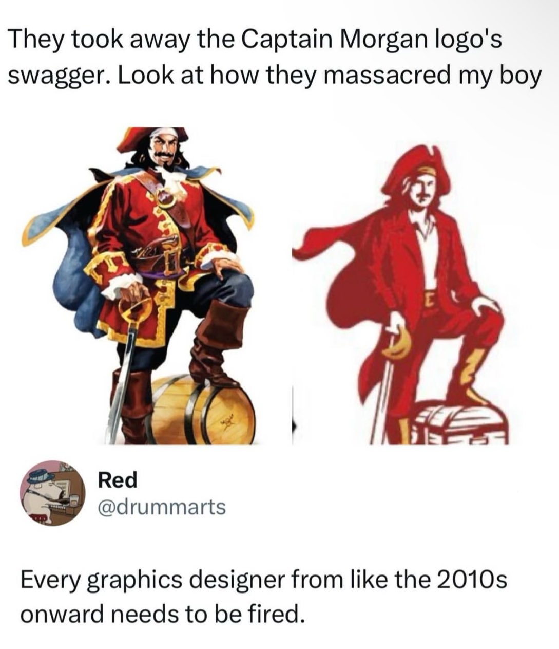
My guess is this saved somebody money.
Simpler design = fewer colors = lower printing cost.
Sometimes this can just be ink cost. Sometimes it can make discrepancies between printers less noticable.
Could still be the other things too
I heard somewhere before that often these simplistic logo changes are due to how they look on thumbnails, mobile devices etc. Unsure of the evidence there but it made sense to me. I still hate it though.
Can't wait to download My Captain Morgan app and... Drink?
Lol like when the iPhone was first getting big and there was those "drinking apps" where you turn the screen and pretend to drink.
Generally it's not much savings if any to do more than 1 spot color instead of full process cmyk. It might even be more expensive since it's a new setup for the printer. Given the volumes they're printing at it's probably basically a wash.
Okay but then why is he less buff??
Less ink, obviously