this post was submitted on 27 Jan 2024
514 points (85.0% liked)
Data Is Beautiful
6882 readers
2 users here now
A place to share and discuss data visualizations. #dataviz
(under new moderation as of 2024-01, please let me know if there are any changes you want to see!)
founded 3 years ago
MODERATORS
you are viewing a single comment's thread
view the rest of the comments
view the rest of the comments

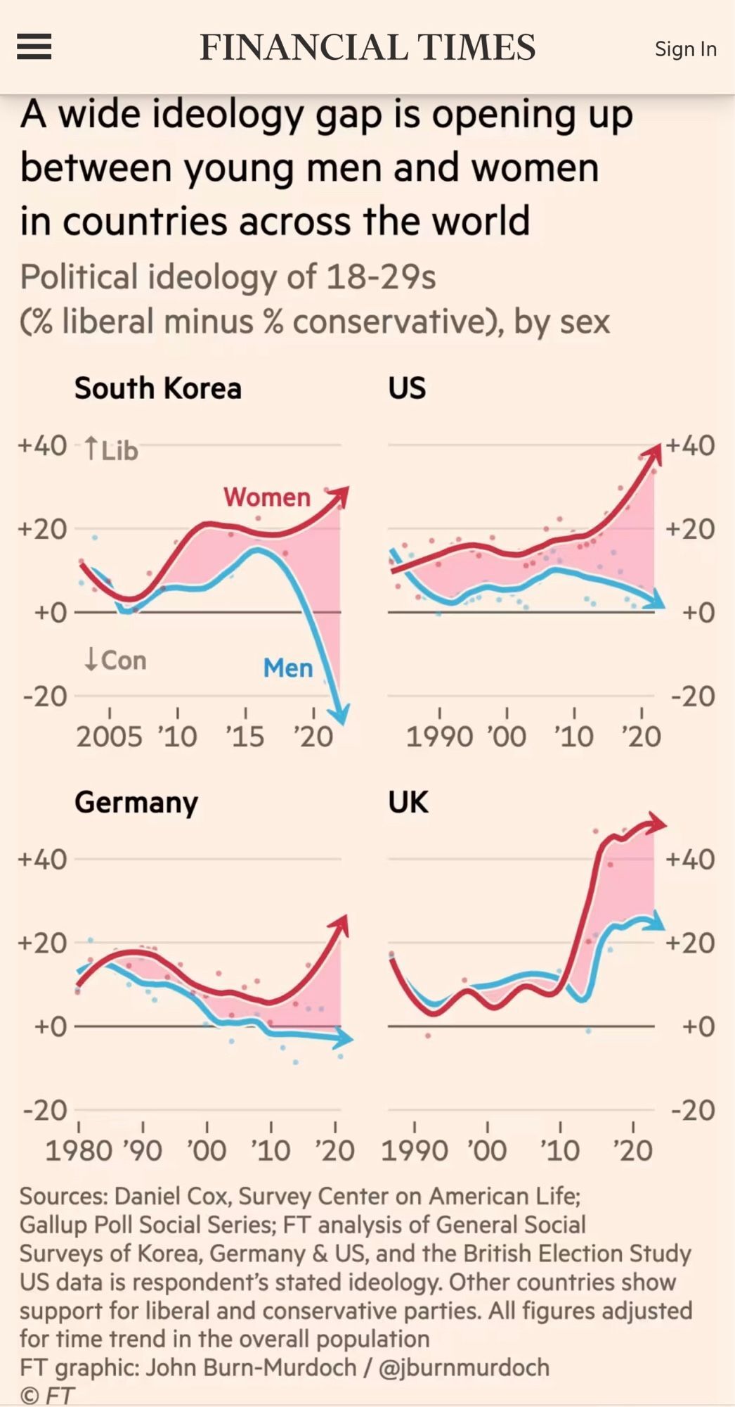
This data is anything but beautiful. Its horrendously laid out. Not intuitive in the slightest.
That's on purpose. It's a conservative opinion piece.
Aha, that explains the weird positioning of the zero axis.
If only there was a way to talk about political ideology that indicated some kind of direction, then we could orient the data in such a way that the arrows went in the direction of that ideology.