31
FEMA Natural Hazards Risk Index
(cdn.fosstodon.org)
FEMA Natural Hazards Risk Index
@map_enthusiasts
Source: https://hazards.fema.gov/nri/map
#maps
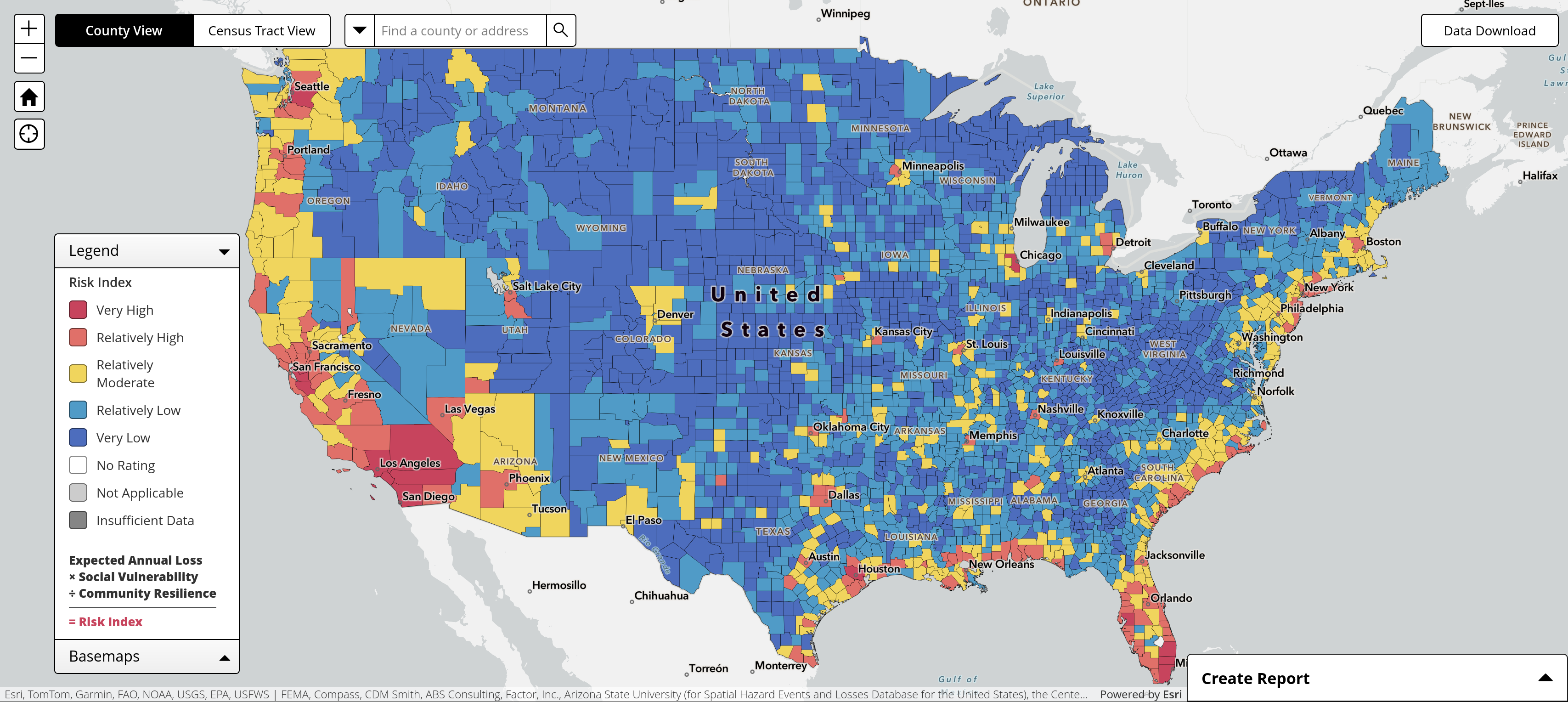
This looks suspiciously like a population density map.
Apparently the calculation includes "Social Vulnerability", which looks very much like a population map. Which is probably why my city is yellow due to winter weather even though the surrounding counties are blue.
Yeah they should really call it the Disaster Risk Index because hazards are only part of the disaster equation, the other part is vulnerability.
A tornado in the ocean isn't a disaster.
Buffalo, eh?