this post was submitted on 01 Nov 2023
258 points (97.1% liked)
Data Is Beautiful
6884 readers
262 users here now
A place to share and discuss data visualizations. #dataviz
(under new moderation as of 2024-01, please let me know if there are any changes you want to see!)
founded 3 years ago
MODERATORS
you are viewing a single comment's thread
view the rest of the comments
view the rest of the comments

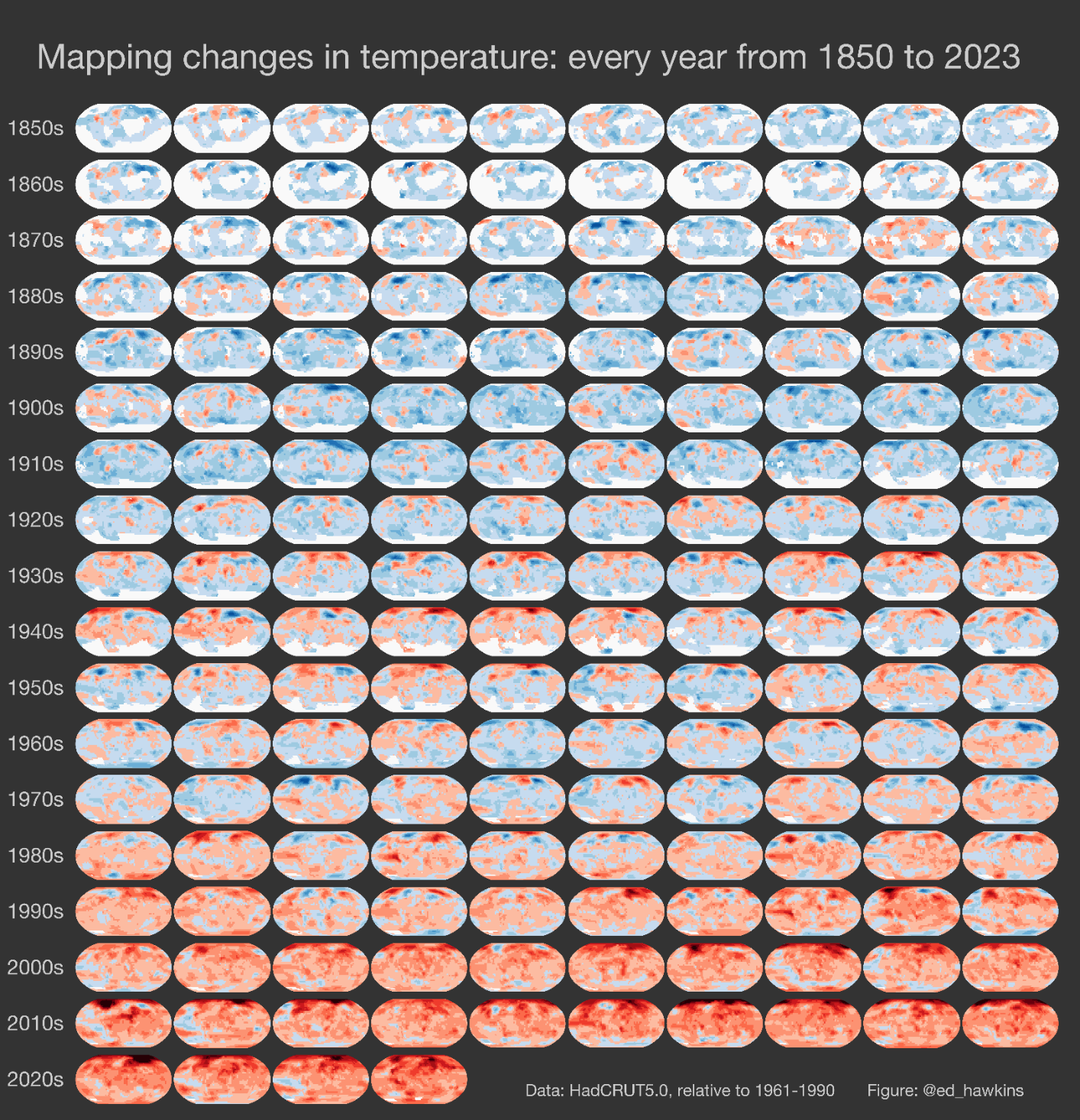
I'd just have thought they had some absolute scale going. It's a relative scale. This can lead to wildly wrong conclusions. Not in this case as the message would be the same mostly, but still.
Relative scale is worse. Not only that the temperatures keep going up and aren't a fixed "red", but that there's few to no blues now, meaning it's always going up everywhere. And this is actually a more calming way to present it that the usual exponential spike chart.
We need a color that's more alarming than red to switch to next
The temperatures are relative to the 1961-1990 average for that region, from the HadCRUT5 dataset.
Edit: I'm just going to find out if it's relative to the average, or just lowest value is blue, highest is red.
The footnote detailing this is maybe a little unclear.
Also by Ed Hawkins: The climate stripes