this post was submitted on 20 Oct 2023
170 points (96.2% liked)
Firefox
17902 readers
27 users here now
A place to discuss the news and latest developments on the open-source browser Firefox
founded 4 years ago
MODERATORS
you are viewing a single comment's thread
view the rest of the comments
view the rest of the comments

And..? So what, if a design works, a design works. This is a colour picker.
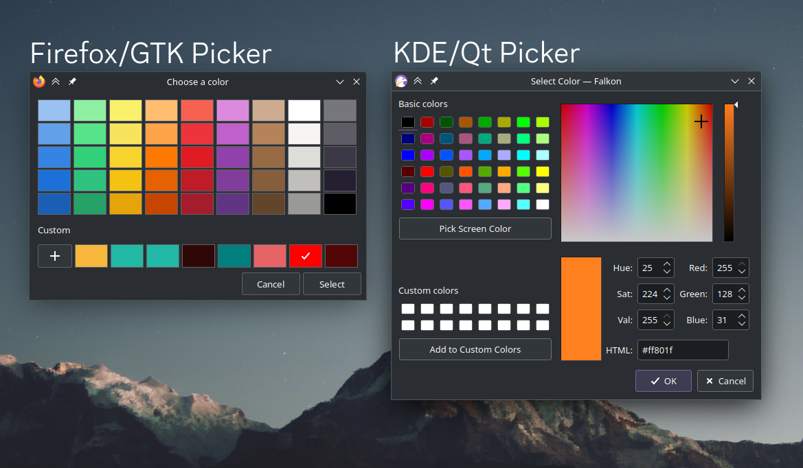
IMHO a better design would be a mix between the two.
The left one has much better color palettes. Bigger, with a much nicer color selection than just "neon colors" on the right one. But without a color selector/slider it's unusable for advanced users. Should have an expandable panel with the hue sliders. And a color picker if I want to take it from somewhere else in the screen
I can't check at the moment but Firefox one has the custom field, so probably you need to add a custom colour to access those inputs