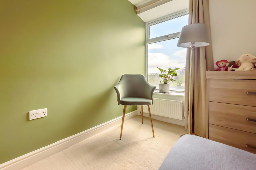
It's a nice photo, but I think it still fits here because it's terrible at showing the real estate listing. Unless you really care about the condition of the walls. lol
Terrible Estate Agent Photos
Terrible photos listed by estate agents/realtors that are so bad they’re funny.
Posting guidelines.
Posts in this community must be of property (inside or out) listed for sale which contains a terrible element. “Terrible” can refer to:
-
the photo itself (finger over the lens, too far away, people in the shot, bad Photoshop, etc.)
-
the property (weird layout, questionable plumbing, unsound structure, etc.)
-
the interior (carpeted bathrooms, awful taste interiors, weird mannequins/taxidermies/art, inflatable pools indoors, etc.)
-
the actual listing itself including unusual descriptions and unrealistic pricing. However, this isn’t a community to discuss the housing market in general. This is a comedic community - let’s keep it light.
-
Photos can be sourced from anywhere and be any age, but please check they haven’t already been posted.
-
Censor any names/contact details of private individuals.
-
Mark the post NSFW if it includes nudity or sensitive content
Rules.
This community follows the rules of the feddit.uk instance and the lemmy.org code of conduct. I’ve summarised them here:
- Be civil, remember the human.
- No insulting or harassing other members. That includes name-calling.
- Respect differences of opinion. Civil discussion/debate is fine, arguing is not. Criticise ideas, not people.
- Keep unrequested/unstructured critique to a minimum.
- Remember we have all chosen to be here voluntarily. Respect the spent time and effort people have spent creating posts in order to share something they find amusing with you.
- Swearing in general is fine, swearing to insult another commenter isn’t.
- No racism, sexism, homophobia, transphobia, xenophobia or any other type of bigotry.
- No incitement of violence or promotion of violent ideologies.
Agreed! It’s terrible in a different way and I’m all for it.
No appreciation for the chair? A key piece to be sure!
When you put it that way, it does make sense. That said, it could be one of 50 photos.
I've seen an uptick in pointless real estate photos on listings for genuinely nice properties. Close ups of vases, chairs next to windows, native flowers in the backyard (which are representative of the entire city I live in, so not exactly a unique characteristic), tightly framed photos of the owner's dog looking cute on outdoor furniture, maggie strutting around the lawn. 15 of 30 photos will be like this and I think, if you're not giving me the vase or the dog or the furniture, (I assume the local flaura and fauna comes included) then stop wasting my time with photos.
I get that it's meant to convey the lifestyle you can have if you buy the property, but a wider shot of the patio is going to do that better than a close up of a dog I don't have, on furniture I don't own.
I have to assume it's indulgent behaviour from the photographer who just wants more shots for their portfolio.
It's the Pinterest approach to house sales
Three-legged chairs at that. Next to weirdly high-up plug sockets.
Let me out of this house now please. I want to go home.
The high-up plug sockets are a current buildings regulation so that disabled people have half a chance of using them. You'll find them in any new build/recently renovated property.
Oh, now I feel bad for not considering that. Good to know, though.
That chair was freaking me out, but I think the fourth leg is exactly behind another leg. You can see just a hint of its shadow
Yes honey, but first you have to sit on the chair. It's for your own good.
I can’t believe the number of chuds that find this more unacceptable than a toilet in the kitchen
Whoch of you intelligent folks can tell me what country this without doing a search? I'm thinking the outlet is the key. Honestly asking.
Those look like UK outlets
This was suppose to include a link to the actual listing... Guess I don't quite get Lemmy posting yet haha.
