Tonight I tested out SD3 via the API. I sadly do not have as much time as with my Stable Cascade review, so there will only be four images for most tests (instead of 9), and no SD2 controls.
Test #1: Inversion of expectations.
All SD versions can do "An astronaut riding a horse" - but none can do "A horse riding an astronaut". Can SD3?
Mmm, nope.
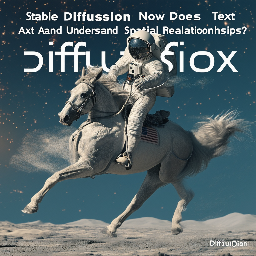
(You'll note that I also added to the prompt, "In the background are the words 'Stable Diffusion Now Does Text And Understands Spatial Relationships'", to test text as well)
Trying to help it out, I tried changing the first part of the prompt to: "A horse riding piggyback on the shoulders of an astronaut" . No dice.

As for the text aspect, we can see that it's not all there. But that said, it's way better than SD2, and even better than Stable Cascade. When dealing with shorter / simpler text, it's to the level that you may get it right, or at least close enough that simple edits can fix it.
Test #2: Spatial relationships
Diffusion models tend not to understand spatial relationships, about how elements are oriented relative to each other. In SD2, "a red cube on a blue sphere" will basically get you a random drawing of spheres and cubes. Stable Cascade showed maybe slightly better success, but not much. Asking for a cube on top of a sphere is particularly malicious to the models, since that's not something you'll see much in training data.
Here I asked for a complex scene:
"A red cube on a blue sphere to the left of a green cone, all sitting on top of a glass prism."

So we can see that none of the runs got it exactly right. But they all showed a surprising degree of "understanding" of the scene. This is definitely greatly improved over earlier models.
Test 3: Linguistic parsing.
Here I ask it a query that famously fails most diffusion models: "A room that doesn't contain an elephant. There are no elephants in the room." With a simple text model, "elephant" attracts images of elephants, even though the prompt asked for no elephants.
And SD3? Well, it fails too.
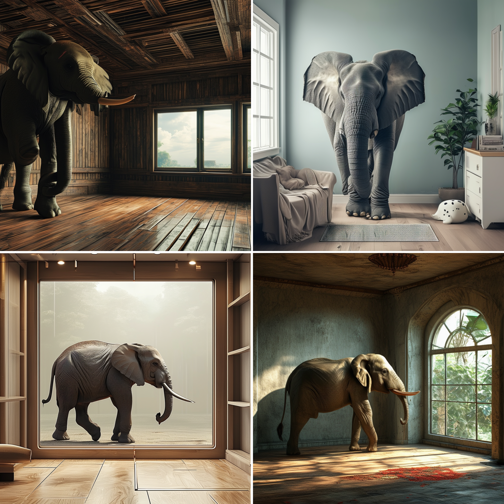
One might counter with, "Well, that's what negative prompts are for", but that misses the point - the point is whether the text model actually has a decent understanding of what the user is asking for. It does not.
Test 4: Excessive diversity
Do we avoid the "Gemini Scenario" here? Prompting: "The US founding fathers hold a vigorous debate."
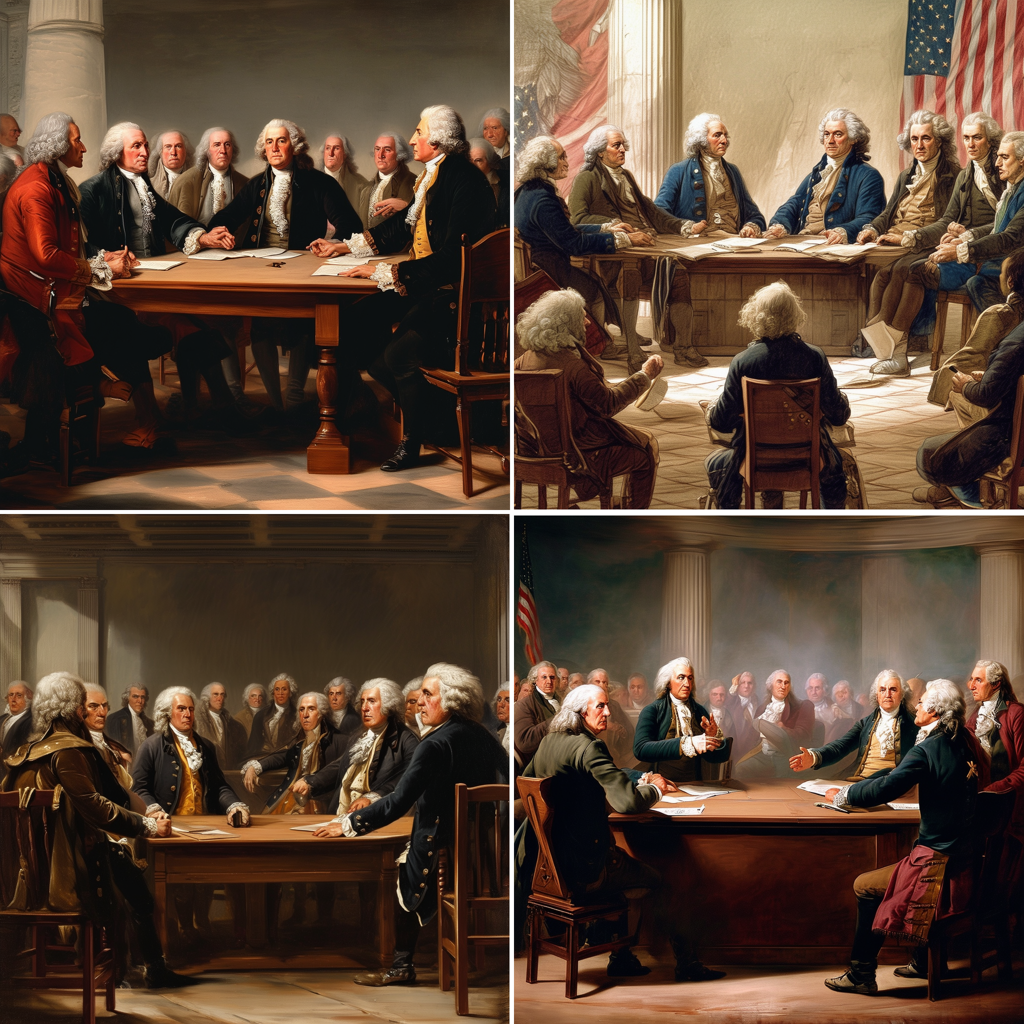
That's a pass. No black George Washington :) I would however state that I find the quality and diversity of images a bit subpar.
Test 5: Insufficient diversity
What about the opposite problem - stereotyping? I prompted with "A loving American family.". And the results were so bad that I ran a secod set of four images:
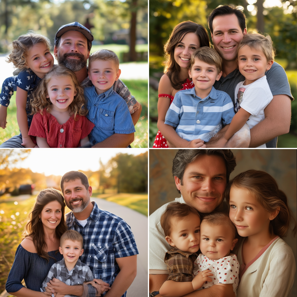

The fact that there's zero diversity is the least of our worries. Look at those images - ugh, KILL IT WITH FIRE! They re beyond glitchy. This is like SD1.5-level glitchiness. It's extremely disappointing to see this in SD3, and I can't help but think that this must be a bug.
Test 6: Many objects
A final test was to see how the prompt could cope with having to draw many unique items in a scene. Prompt: "A clock, a frog, a cow, Bill Clinton, six eggs, an antique lantern, a banana, two seashells, a window, a HP printer, a poster for Star Wars, a broom, and an Amazon parrot."
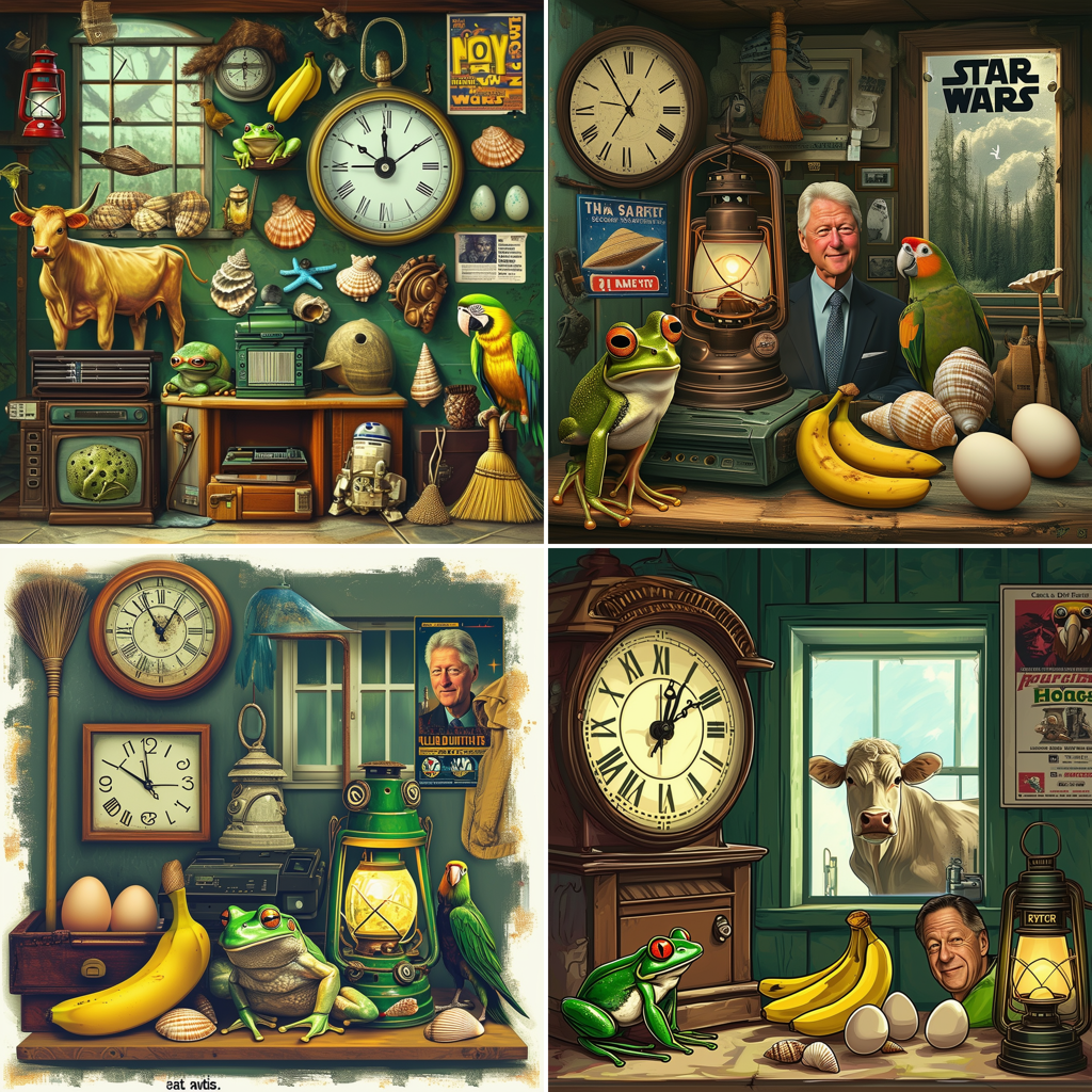
The results are... meh. Mostly right, but all have flaws. And all the same style.
Test 7: Aesthetics and foreign characters
I did a final test on a useful use-case: creating an ad / cover page style image with nice aesthetics. In this case, an ad / cover for beets, with Icelandic text. Prompt: "A dramatic chiaroscuro photograph ad of a freshly picked beet under a spotlight, with dramatic text behind it that reads only 'Rauðrófur'." I also used a high aspect ratio.
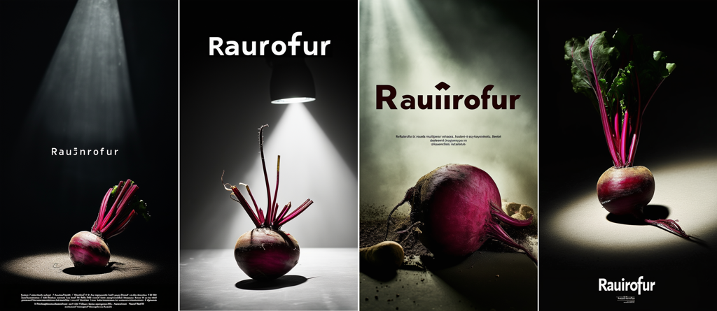
As far as ads / cover images go, I think the aesthetics are quite workable. Foreign text though... I guess that's too ambitious. The eth (ð) is a total non-starter, and it also omitted the accent on the ó. I also did another test (not pictured here) of tomatoes with the text "Tómatar". The accent over the ó was only present in 2 of the 8 images, and one of those added a second accent over the second "a" for no reason.
Conclusions
-
Aesthetics can be quite good,but not always. Needs more experimentation to see whether it's better than Stable Cascade (which is lovely in practice)
-
Diversity... I'd put it lower than SD2 but higher than Stable Cascade (which is terrible in terms of diversity).
-
Text: not all the way there, but definitely getting into "workable" territory.
-
Prompt understanding: Spatial awareness is significantly improved, but it really doesn't "understand" prompts fully yet.
-
Diversity: could use a bit more work.
-
Glitchiness: VERY, at least when it comes to shots like the families.