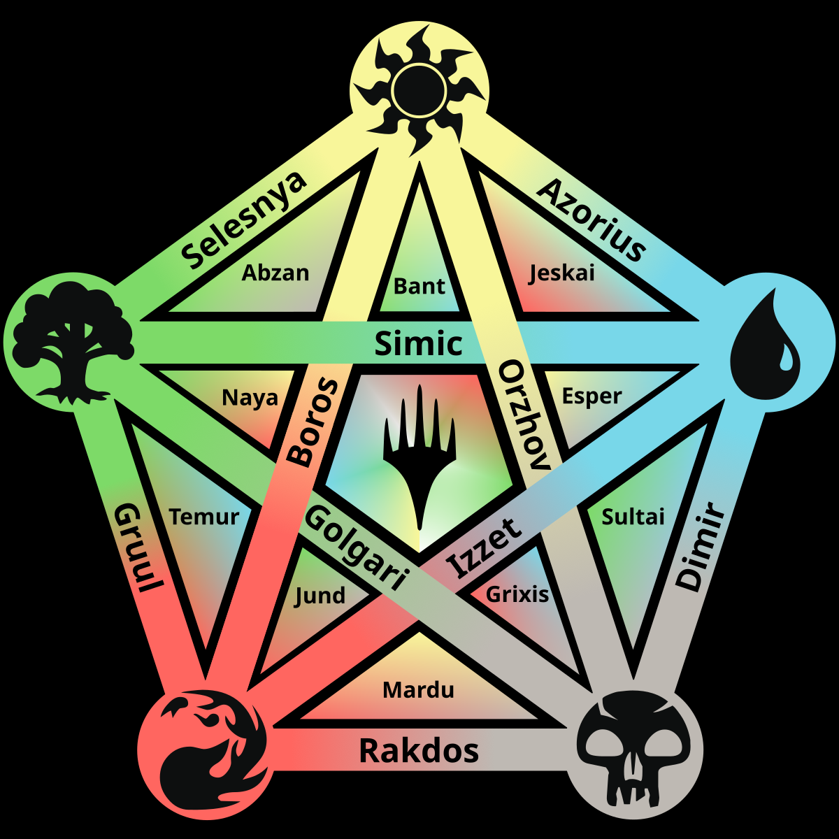
I like this one much better than the original colour pie that was posted here, this one's much easier to read and more intuitive <3
this post was submitted on 31 Oct 2023
42 points (95.7% liked)
MTG
1925 readers
18 users here now
Magic: the Gathering discussion
General discussion, questions, and media related to Magic: the Gathering that doesn't fit within a more specific community. Our equivalent of /r/magicTCG!
Type [[Card name]] in your posts and comments and CardBot will reply with a link to the card! More info here.
founded 1 year ago
MODERATORS
Yeah, this finally clarifies where the terms shard and wedge come from for me!
I was thinking while looking at the earlier version that background gradients would make it easier to read. This is indeed an improvement.
This is awesome! Great work on this, super useful reference
Thanks!
