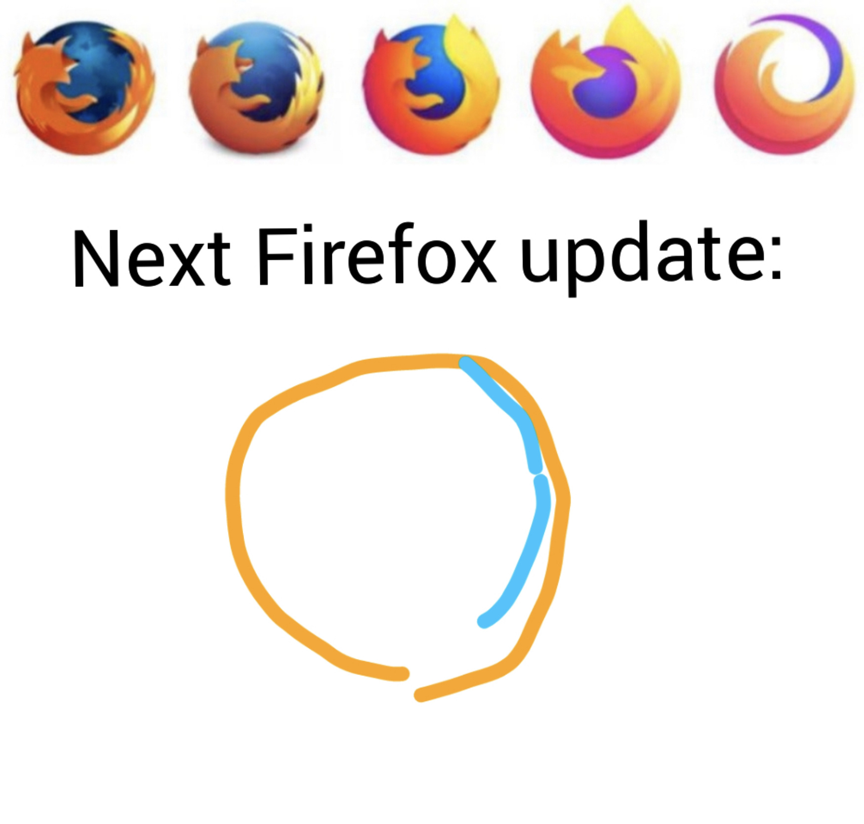
Logo on the top right has never been used as a logo for the Firefox Browser. It’s used for the Firefox brand of products
Logo on the top right has never been used as a logo for the Firefox Browser. It’s used for the Firefox brand of products
It’s used for the Firefox brand of products
where?
Two of these have since been discontinued, one is a Have I Been Pwned reskin. Poor Mozilla, struggling to find alternative revenue sources to cut its Google dependence.
Honestly they should take notes from the Wikimedia Foundation. While they are funded by donations, Wikimedia created a trust that will ensure, without hyperbole, that they never run out of cash
I assume that developing and maintaining a browser with its own HTML/JS/CSS engine is orders of magnitude more expensive than running Wikipedia's servers though. There's a reason why all other browser companies (except Apple) are all building on top of Chrome.
Idk they could also pay the CEO less money too.
What kind of freedom hating pinko talk is that?
I don't know what she does day to day, but Firefox usage is going down the toilet and the rest of Mozilla seems mismanaged. Maybe decreasing her salary and hiring some more engineers might help. Right now Google seems to be keeping Mozilla alive to prove that they supposedly aren't a monopoly. Now she did join after the user trend was already plummeting, but idk $3+ mil is a lot of money to not turn the ship around.
It would just be nice to have an actual chromium competitor.
https://en.m.wikipedia.org/wiki/Firefox_logo
Scroll down to the "Transition to overarching identity and simplicity (2018–present)" section under history.
Here's my creation/guess:

Licence: Public Domain
I think "the more global warming accentuates, the bigger the Firefox and the smaller the globe" is the consistent rule. and when it's just an orange circle with 0 fox elements, and no blue left, our time will be up as a species. Just fire will remain.
When I say you're over interpreting, I'm not saying you're wrong
sirko.
I like this logo.
The globe used to be caressed by the foxlike flame, now reduced to a mere line. Appropriate, as the world is mostly now on fire.
They should make the next one photo-realistic, just to change things up.

I still prefer the foxy look tho

That's not a firefox! That's a raccoon dog!
Isn't that a red panda?
Nah, same level of detail but change direction of rotation.
Just flip the image vertically

Much better, thanks.
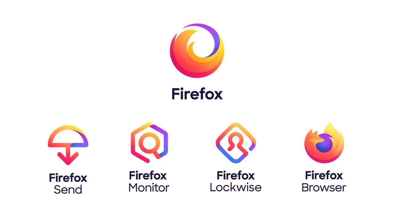
Last one isn’t the browser’s logo. It’s the logo for the branded suite of products. Browser still has a fox.
https://www.theverge.com/2019/6/11/18661931/mozilla-firefox-logo-new-design-more-fire-less-fox
Yeah, it sucked how popular that meme got without people realizing that the logo hadn't changed.
It really showed how few actually use Firefox
The right one is Firefox the company not Firefox the browser
Unpopular opinion: I like the new Firefox logo. It's clean, but still has the essence of the original logo. Unlike most other simplified logos, this one's actually good. If you wanna hate, go see Dunkin' Donuts' logo.
The top right one isn't real, is it?
Yes and no. It’s a logo by mozilla for sth firefox related but not the actual Firefox logo
it's real but it's not for Firefox itself, I forget the exact description, like it covers other products that use the Firefox branding
It is also important that it resizes well.
they amputated his paw
I don't understand the hate for minimalism, I've always liked it.
Imo the fourth logo (from the left) is the best, minimalism done right.
Personally, I miss the creative and possibly goofy looking art
I would take the left most(the first one) over all the others, I like to look at it and contemplate the smaller details
Well, then you'll be happy. Because that's the current logo, for the indefinite future (as far as we know).
I remember when it was Mozilla, and the logo was a dinosaur.
It is still Mozilla, but the logo is a logotype of "moz://a" now.
Mozilla (the foundation) owns Mozilla (the corporation). They jointly manage the development of Firefox (the brand), of which Firefox (the browser) is a part; as well as Firefox (the email anonymizer) and Mozilla (the VPN).
I feel like they might need to come up with some new trademarks.
This would make an awesome April fool's joke.
But softwarewise, what the heck is Firefox Focus?
I just tried it and it has no Addon support thus no adblock, why would anyone use that?
I'll answer because I use it all the time....
It's the default browser on my phone so all link clicks in apps (like the one I'm using now) get a fresh, zero cookie session which reduces tracking. I read or watch, hit back, session and cookies destroyed, off I go on my merry way.
If I want to open a link on a site that I want to be logged in on then I long press and open it in normal Firefox.
I do have ad blockers on my router too though.
You can just set a shortcut for private browsing and set a flag in nightly to always be private.
To focus on the ads
What's the next geometric shape for icons, though? Everyone made square icons before they evolved into circles. I think hexagons are the future.
The 2009 logo was the best
First on was the nicest, it's okay now but I don't like the flat icon trend
sirko