ELI5 please, what's digital camouflage?
Mildly Interesting
This is for strictly mildly interesting material. If it's too interesting, it doesn't belong. If it's not interesting, it doesn't belong.
This is obviously an objective criteria, so the mods are always right. Or maybe mildly right? Ahh.. what do we know?
Just post some stuff and don't spam.
Other commenter touched on one definition so I'll explain the other.
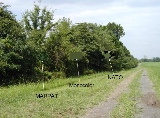
Take a bunch of pictures of the woods, put them in a computer and have it tell you the most common colors to generate the a pattern of the most commonly found colors. Boom digital woodland camo.
And what benefits does it have compared to regular camo? Or is it just aesthetics?
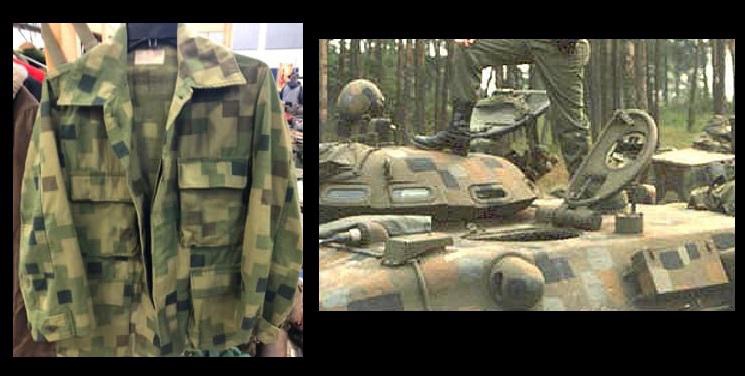
There is a link in the opening post with some background on Dual Tex.
It was an early attempt at having a pattern methodically designed to have macro and micro patterns, aka “dual textures” to help it work at closer and further ranges.
The squares were (on most iterations, some more primative tests had eyeballed patterns) derived from using a grid to create the pattern, with a grid being useful to help design a pattern with a good spread of colors.
Macro patterning is important to the military since observation and initial engagements usually occur in the multiple hundreds of meters, which is why US Woodland is derived from ERDL that has been greatly enlarged. If a pattern achieves good macro patterning, then micro patterning can help it work at closer ranges. Generally micro patterning is more useful in environments with lots of depth in them like jungles or woods, which is why patterns for those environments tend to be more complex than desert patterns.
Later digital patterns for uniforms that were created with computer assistance, like CADPAT used squares for the same reason of ease of design, and because it is easier to print patterns with distinct shapes rather than gradients. Multicam is an example of a pattern that is newer than CADPAT, which is using gradients.
It blends in really well, especially in pictures.

Specifically, it looks like digital artifacting.
Theoretically you're using actual colors taken from a (or several) environments that you intend to be in. As opposed to a few colors picked by an artist because the artist thought they'd be the colors in those environments.
As for the squares I think it was just an easy way to formulate a pattern digitally. Plus it seemed futuristic at the time.
Squares
Here is a video by Half as interesting that talks about the creation of digital camouflage and why the US's army version sucks if anyone is interested.
It's about six minutes long
The Dual Tex in the original post is mentioned in your video, but only in the barest passing.
The video seems like a very lacking overview of UCP. Even in its short runtime contains a least a few common mistakes, like identifying UCP as renamed Urban Track, and it doesn’t really talk about why the chosen colors were chosen. The chosen colors were a mistake, but an informative video about why a mistake was decided on is more productive that’s just pointing out the obvious.
This link is much better. It both identifies the flaws, and it illuminates the (admittedly mistaken) thought process behind the color choices of UCP.
My current view is that either the people running the tests only wanted a camo that blended perfectly into piles of gravel and old lady couches and absolutely nothing else, or they had legally blind people performing the tests. I strongly doubt this link will change my mind but I'll give it a shot.
The TLDR is the focus of the design was entirely on defeating NIR, at the expense of other considerations.
It was somehow worse than I thought.
nah that's just their creeper cosplay
Looks pretty analogue to me
My understanding of the Desert Storm digital camo is that it works because they were doing a lot of city fighting. Camouflage works by breaking up your silhouette against the background. Since there aren't really any straight edges in nature, they use rounded splotches for jungle warfare. Since there are a lot of straight edges in cities, they used straight edges for the splotches. If this camo was intended for jungle use, then it was probably a lot less effective than the traditional camouflage, which is probably why it didn't replace the organic camouflage.
I think you’re a bit turned around. The only grid pattern camouflage used in Desert Storm in any appreciable amount was Desert-Night. (Which I’m not actually sure was designed with digital aid or not). Desert-Night camouflage was intended to defeat older generation night vision by blending into the grain of older night optics. Essentially to hide people in the static.
Dual Tex was an earlier experiment where the straight shapes were a result of the primitive ways of arranging digitally assisted patterns. It was intended primarily for Europe, but more than that was a proof of concept of the macro/micro patterning technique which did eventually become standard. In the 1970s the ERDL patterns could be considered micro only, and the following “M81” US Woodland being a macro only pattern. Dual Tex had the idea of inserting a micro inside a macro without disrupting the macro’s effectiveness.
The straight edges have proven not to be much of a detriment, as the vast majority of digital personal camo use squares are a base shape. (Digital camo strictly speaking doesn’t need square pixels but for practical reasons usually uses them). Follow up digital pixel camos did try to find a sweet spot for pixel size, as pixels that are large will make the camo less effective up close, but pixels too small can result in “blobbing” which makes the wearer distinct at a distance.
While the US hasn’t adopted digitally aided pattern designs on vehicles, a number of countries or units in them have. Vehicle camo follows the same concept as personal camo, although intended for a longer range.
