this post was submitted on 08 Jul 2023
52 points (100.0% liked)

ErgoMechKeyboards

5857 readers
2 users here now

Ergonomic, split and other weird keyboards

Rules

Keep it ergo

Posts must be of/about keyboards that have a clear delineation between the left and right halves of the keyboard, column stagger, or both. This includes one-handed (one half doesn't exist, what clearer delineation is that!?)

i.e. no regular non-split¹ row-stagger and no non-split¹ ortholinear²

¹ split meaning a separation of the halves, whether fixed in place or entirely separate, both are fine.
² ortholinear meaning keys layed out in a grid

No Spam

No excessive posting/"shilling" for commercial purposes. Vendors are permitted to promote their products/services but keep it to a minimum and use the [vendor] flair. Posts that appear to be marketing without being transparent about it will be removed.

No Buy/Sell/Trade

This subreddit is not a marketplace, please post on r/mechmarket or other relevant marketplace.

Some useful links

founded 1 year ago
MODERATORS
 

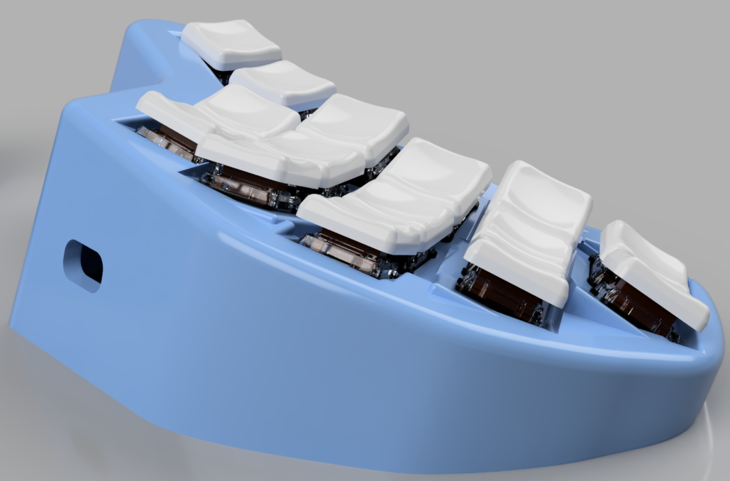
Long time lurker, first post. More pics here.

My design has elements we are familiar with: columnar stagger, the Dactyl "scoop" (concave shape), and some splay (columns angled outward). But I've added an element I haven't seen in any keyboard before (though I did get some hints from this community).

Try this: look at your nails with your palm facing toward you (so your fingers will be pointing down toward your wrist). Notice that the tips of your fingers form a curve like a smiley-face. 🙂 That's the "scoop".

Now notice the angle of your fingers - they point inward. This is what your fingers do when they are curled over the keyboard (photo). Sculpted boards I've seen either have none of this angle, or they follow the concave scooped shape and set it in the opposite direction.

Keen to hear your thoughts, and I'm open to name suggestions!

EDIT: Changed photo

EDIT: Don't like how loud the hollow body sounds, going to explore a quieter body design.
top 19 comments
sorted by: hot top controversial new old
[–] NoamVokaal@lemmy.world 3 points 1 year ago

Excellent work! I’ve wanted to implement this feature in a future keyboard as well. The angle of pinky columns on Dactyl keyboards have always felt a bit weird to me since the row curvature achieves the exact opposite of this.

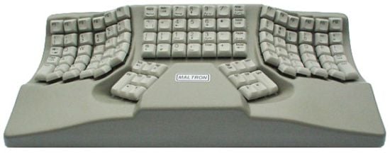
Actually, some of the later Maltron keyboards have angled columns like this.

[–] kukkurovaca@lemmy.blahaj.zone 3 points 1 year ago (1 children)

Finally, a keyboard I can connect my garden hose to!

[–] aquaAsparagus@lemmy.world 2 points 1 year ago

Could call it the "sprinkler"...

[–] aquaAsparagus@lemmy.world 3 points 1 year ago

Some more details:

  • Choc switches (crystal reds)
  • PBT keycaps from aliexpress
  • Handwired (PCB possible, maybe...)
  • Seeeduino XIAO SAMD21
  • Built-in 15-degree tent angle
  • Steel plate at bottom for weight and sound dampening, hopefully
  • 4-pin microphone connectors to connect the halves
  • 30-key layout inspired by Hummingbird
[–] rafaelromao@lemmy.world 2 points 1 year ago (1 children)

Great project. It is really nice to see other 30 key boards. I daily drive a Rommana today and would really like to try one of these. Are you planning to make this project open source?

[–] aquaAsparagus@lemmy.world 2 points 1 year ago

Good to hear. Yes I will make this open source, hopefully within a couple weeks.

[–] Aldoo@lemmy.world 2 points 1 year ago (1 children)

It's an interesting design. I wonder if that could work with high profile MX switches and keycaps.

In Dactyls, the reason keys often face inward is as to keep key tops is close to each other as possible. Facing outward would obviously have the opposite effect, but with low profile keys it is less noticeable.

Now, there is one case you really want the keys closer, it is between 2 columns belonging to the same finger.

[–] aquaAsparagus@lemmy.world 1 points 1 year ago

You're right, it wouldn't necessarily work as well with high profile MX switches, unless someone has bigger hands. Having only 2 keys on the inner index column helps to mitigate some of the extra reaching - but, that's not for everyone. Ideally there would be no inner index column. One day...

[–] anaumann@lemmy.world 2 points 1 year ago (1 children)

yay, two pinky gang!

Personally I prefer still having 3 keys on the inner index column as I find it easier to hit inner column keys if they are part of one of the rows (and I only use the homerow pinky + don't like chords, so having 3 inner column keys per half is preferable to me).

Naming wise, you could always go for silly portmanteaus like "scoolp" (scoop + sculpted) or "scoob / scooboard" (scoop + keeb / keyboard) ;)

[–] aquaAsparagus@lemmy.world 2 points 1 year ago

Thanks! With that much stagger on the pinky column, and the pinky being significantly shorter, it just made sense to me.

[–] jaredj@infosec.pub 2 points 1 year ago (1 children)

Awesome! The only other keyboard I've seen this on is the Ergowarp. I couldn't quite manage to tweak it properly, and I have so many nice-to-have requirements floating around in my head that I can't progress with a design. Well done!

[–] aquaAsparagus@lemmy.world 1 points 1 year ago

I get that, this design has been brewing for years with no visible progress until recently.

[–] Gumshoe@lemmy.world 2 points 1 year ago (1 children)

The way the pinky row meets your pinky in the final picture is really satisfying. Its hard to tell using just the last picture, but I think your typing position has your fingers a bit more extended than mine and your typing, while still largely with the tips of your fingers, I'm even closer to the direct tips than you are with more finger curl while typing.

If I do the same smiley-face exercise, I only get the smiley-face if I don't bend my knuckles very far. As I curl my fingers in more towards either my knuckles or center of my hand, the smiley face disappears and even eventually inverts (though that inversion happens far past what would be comfortable for typing). The amount of curl I have for my normal typing is pretty neutral and doesn't really make the smiley face.

[–] aquaAsparagus@lemmy.world 1 points 1 year ago

Interesting, thanks for playing along. I guess fingers vary here. If you don't get the smiley face for typing, I guess you prefer a flat board as opposed to a sculpted board? Do you see a similar amount of inwards angle on your fingers?

[–] sin_free_for_00_days@lemmy.one 1 points 1 year ago (1 children)

I'm not sure that I'd like a convex shape, but I love to see it. Nice work.

[–] aquaAsparagus@lemmy.world 2 points 1 year ago* (last edited 1 year ago) (2 children)

It's actually concave, in that the pinky and index are higher off the table, like in the Dactyl. It looks convex in the photo because the columns are angled outwards. The other photos might show this better. EDIT: I picked a better photo for the post to make the shape clearer.

[–] Aldoo@lemmy.world 2 points 1 year ago* (last edited 1 year ago)

~~Convex in the X direction, concave in Y one, it's a saddle shape, isn't it?~~

Edit. Ah no sorry it's more subtle: there is a stairway effect. The keys face outward, but those in the middle are indeed deeper!

Ah, that was a confusing perspective.

[–] muppetjones@lemm.ee 1 points 1 year ago

Really interesting! I'm not sure I'm willing to drop below 34, but this design makes me want to consider it.

load more comments
view more: next ›