this post was submitted on 19 Jul 2024
392 points (95.0% liked)
memes
10322 readers
2521 users here now
Community rules
1. Be civil
No trolling, bigotry or other insulting / annoying behaviour
2. No politics
This is non-politics community. For political memes please go to !politicalmemes@lemmy.world
3. No recent reposts
Check for reposts when posting a meme, you can only repost after 1 month
4. No bots
No bots without the express approval of the mods or the admins
5. No Spam/Ads
No advertisements or spam. This is an instance rule and the only way to live.
Sister communities
- !tenforward@lemmy.world : Star Trek memes, chat and shitposts
- !lemmyshitpost@lemmy.world : Lemmy Shitposts, anything and everything goes.
- !linuxmemes@lemmy.world : Linux themed memes
- !comicstrips@lemmy.world : for those who love comic stories.
founded 1 year ago
MODERATORS
you are viewing a single comment's thread
view the rest of the comments
view the rest of the comments

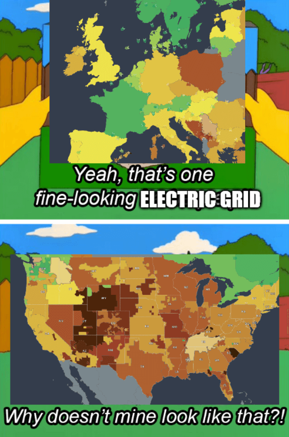
Sure but there are also regional divisions like on this map. There's even connections between Texas and East and West grids, they're not even totally separate
yeah regional divisions make sense, but i'm not sure why they would matter all that much, in the grand scheme of things it's not exactly "my problem"
I wouldnt be surprised if they weren't fully separate, from what i understand though, texas has a pretty much isolated grid since that allows them to get around federal regulations for power production. And the east and west would more than likely be a systems scale thing, it's just better to have it split down the middle. Considering how few people generally live there.
iirc they're connected via DC not AC so they have "local" control over maintaining the 60hz frequency.
You can see live stats here.
that would actually make a lot more sense, it would also explain why they're "separate" grids as well.