649

you are viewing a single comment's thread
view the rest of the comments
view the rest of the comments
this post was submitted on 22 Jul 2023
649 points (98.4% liked)
World News
32114 readers
1254 users here now
News from around the world!
Rules:
-
Please only post links to actual news sources, no tabloid sites, etc
-
No NSFW content
-
No hate speech, bigotry, propaganda, etc
founded 5 years ago
MODERATORS
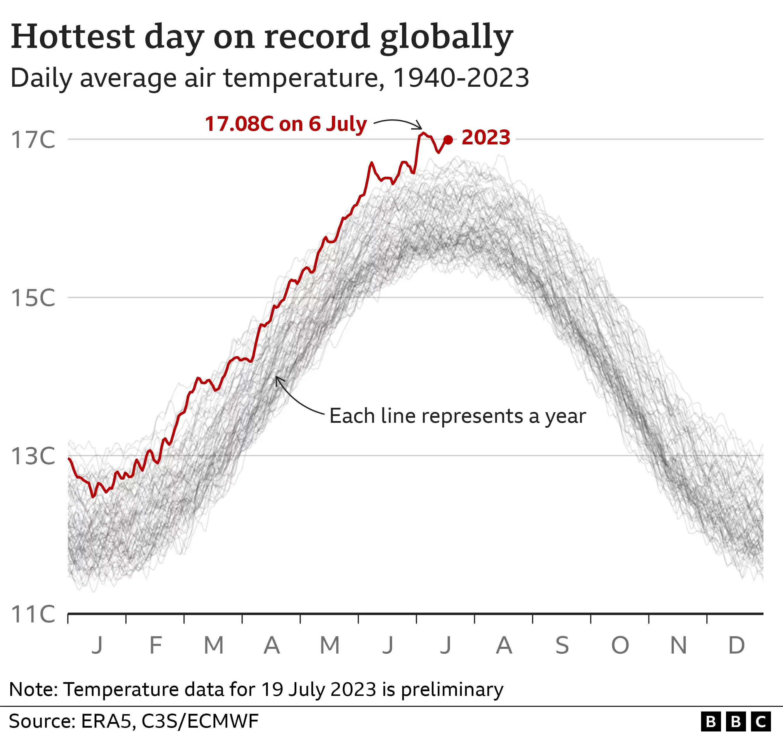
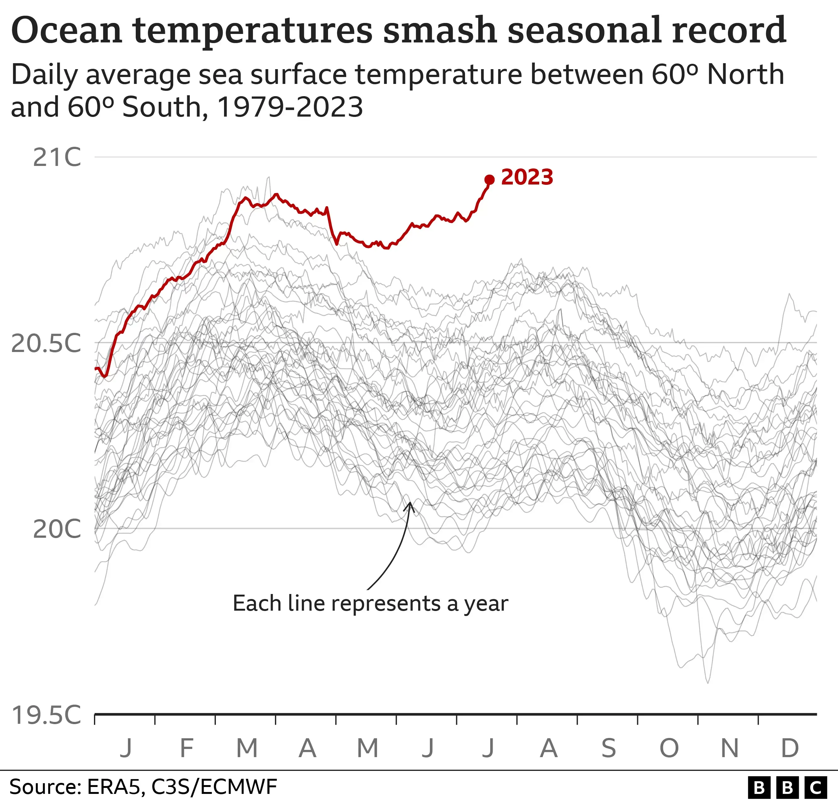
I've seen the first chart in a lot of news stories, and it's a scary graph, but that second one looks positively terrifying by comparison.
And the Antarctic ice figure is even more severe. The trend is quite stark.
I dunno dude.. They all just get progressively worse.