this post was submitted on 25 Apr 2024
1137 points (97.6% liked)
People Twitter
5226 readers
3474 users here now
People tweeting stuff. We allow tweets from anyone.
RULES:
- Mark NSFW content.
- No doxxing people.
- Must be a tweet or similar
- No bullying or international politcs
- Be excellent to each other.
founded 1 year ago
MODERATORS
you are viewing a single comment's thread
view the rest of the comments
view the rest of the comments

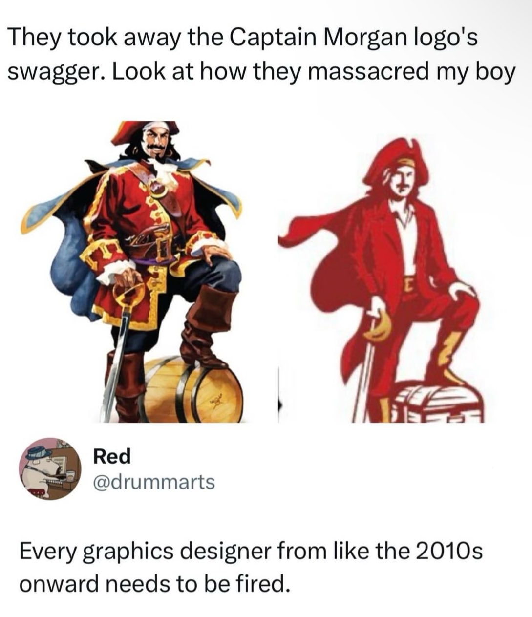
Of all places, rum bottles ain’t the place for flat design. One reason why flat design is often used is that it does well small as big, especially on a computer monitor.
Captain Morgan is a character that takes up the entire rum bottle. There’s never an instance where the Captain Morgan character is going to be as small as a fingernail.
And for some reason this designer felt the need to make the colors mute.
At least they really nail the cheap rum feeling.
Look at all the different ink colours in the OG design. Those all have to be printed with spot colour ink. Maybe their printer is mixing CMYK themselves, but for a diago brand I doubt it.
The difference in the Reds of the new design looks like it is just shading. Which means, aside from the gold, you can use the same red ink for the entire logo.
How much money is being saved not having to constantly buy and restock all those different inks? How much has the redesign increased the profit margin for each bottle sold?
That’s a valid point, but if cost of ink is a major concern then they really station themselves as the cheap rum brand.
Retail printing something like the original label costs some 3 times more than the right... Making for a massive 3 or 4 cents difference on each label. Wholesale printing them has to be much cheaper, but the relative difference probably holds (so yeah, probably a fraction of a cent per label.)
Anyway, somebody probably saved a lot of money when you count each bottle for the lifetime of a printing machine. (Probably even more than they spent on the redesign.) And will get their bonus before the public has a bad reaction to the label.
You thinking they're doing like a million spot colors for that illustration? Id bet it's all process color. IDK though I don't have a bottle to look at on hand. If they are that's pretty wild.