this post was submitted on 16 Jul 2023
464 points (98.1% liked)
Apple
18015 readers
42 users here now
Welcome
to the largest Apple community on Lemmy. This is the place where we talk about everything Apple, from iOS to the exciting upcoming Apple Vision Pro. Feel free to join the discussion!
Rules:
- No NSFW Content
- No Hate Speech or Personal Attacks
- No Ads / Spamming
Self promotion is only allowed in the pinned monthly thread
Communities of Interest:
Apple Hardware
Apple TV
Apple Watch
iPad
iPhone
Mac
Vintage Apple
Apple Software
iOS
iPadOS
macOS
tvOS
watchOS
Shortcuts
Xcode
Community banner courtesy of u/Antsomnia.
founded 2 years ago
MODERATORS
you are viewing a single comment's thread
view the rest of the comments
view the rest of the comments


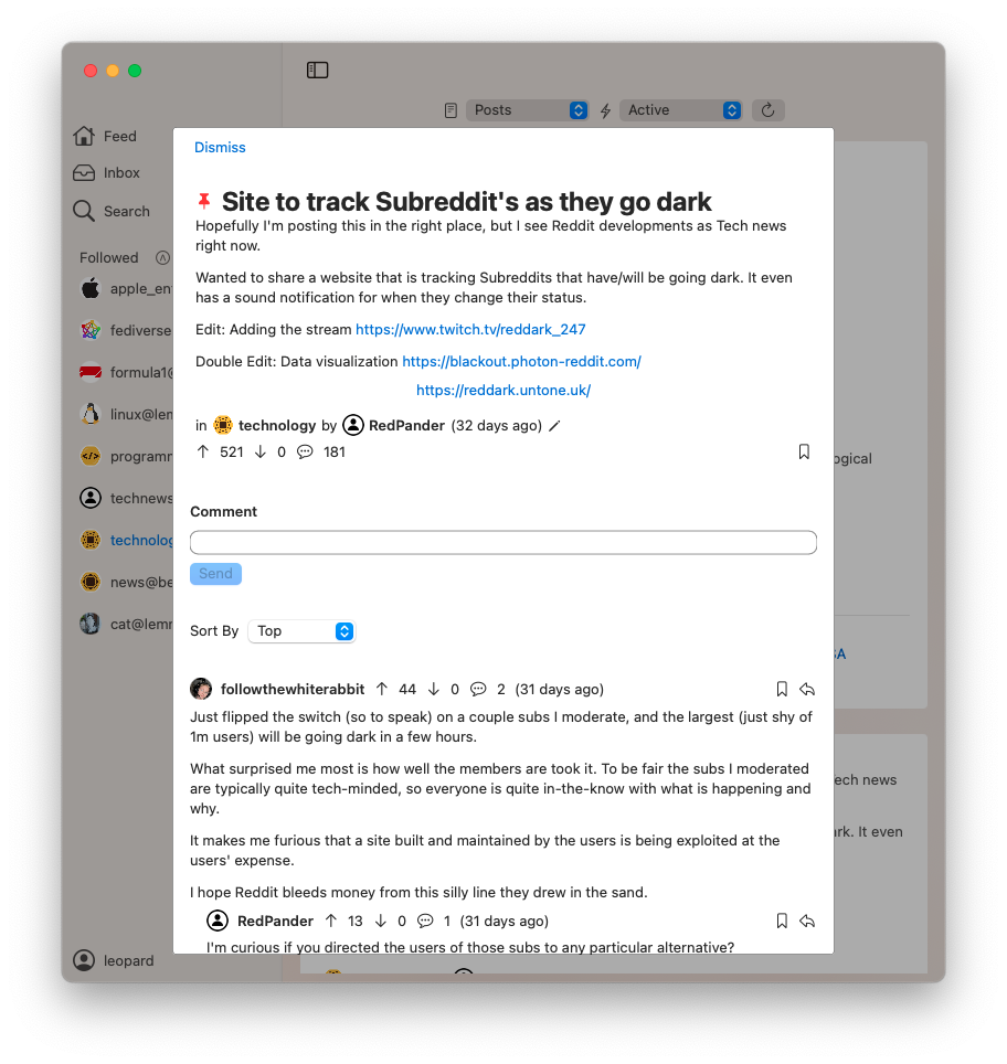
Great start. UI def needs some tweaks (maybe it’s just the colors chosen?) but better than I can do lol
Any specifics to improve?
honestly - if you just copy/use the three column design and color scheme from Reeder this would be damn perfect. I find the 3 column design (like mail, reeder, messages (ok thats only 2 but you get the idea) to be perfect on the bigger Mac screens.
I have 0 idea how hard this would be though.
https://www.macstories.net/reviews/reeder-5-review-read-later-tagging-icloud-sync-and-design-refinements/
Maybe.