ErgoMechKeyboards
Ergonomic, split and other weird keyboards
Rules
Keep it ergo
Posts must be of/about keyboards that have a clear delineation between the left and right halves of the keyboard, column stagger, or both. This includes one-handed (one half doesn't exist, what clearer delineation is that!?)
i.e. no regular non-split¹ row-stagger and no non-split¹ ortholinear²
¹ split meaning a separation of the halves, whether fixed in place or entirely separate, both are fine.
² ortholinear meaning keys layed out in a grid
No Spam
No excessive posting/"shilling" for commercial purposes. Vendors are permitted to promote their products/services but keep it to a minimum and use the [vendor] flair. Posts that appear to be marketing without being transparent about it will be removed.
No Buy/Sell/Trade
This subreddit is not a marketplace, please post on r/mechmarket or other relevant marketplace.
Some useful links
- EMK wiki
- Split keyboard compare tool
- Compare keycap profiles Looking for another set of keycaps - check this site to compare the different keycap profiles https://www.keycaps.info/
- Keymap database A database with all kinds of keymap layouts - some of them fits ergo keyboards - get inspired https://keymapdb.com/
view the rest of the comments

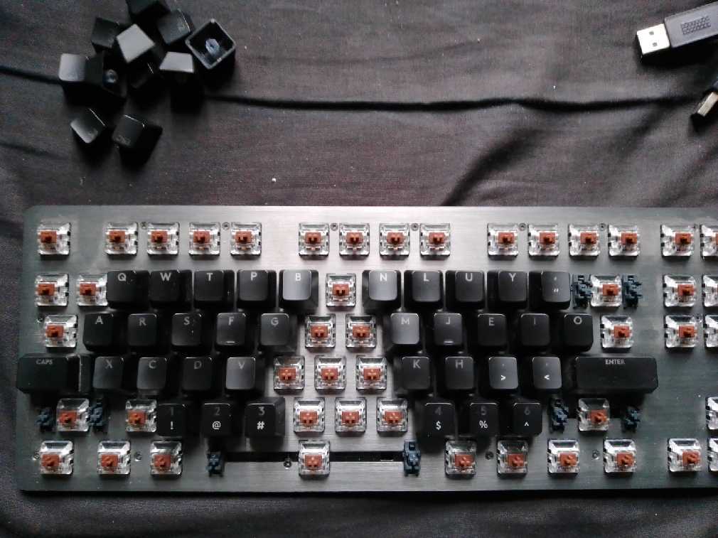
Dvorak is kinda bad compared to other alt layouts. I think the original appeal was that it was built into windows. Or I just picked between colemak and Dvorak randomly lol. There's a lot of math that goes into developing alt layouts, and a lot of it is personal to your use case.
This is the first time hearing someone call it bad, do you have any links explaining why it's bad compared to others?
I don't have any links on hand. I could probably find some later. It's discussed on r/keyboard_layouts. Dvorak has a lot of SFB compared to newer alt layouts, and L on a pinky above S is kinda sus lol
I should add that Dvorak is still leagues better than qwerty
@lambchop I wouldn't call the Miryoku layout bad. I think has some elegance and consistency to it, but I strongly prefer one shot modifiers, which Miryoku doesn't have room for. I created an alternate layout that includes a sixth column on each hand for rarely-used or optional keys. My "markstos" layout is also in the QMK repo for Corne keyboards. There are several other differences as well! I have a page about it here:
https://mark.stosberg.com/markstos-corne-3x5-1-keyboard-layout/
#keyboards #ergomechkeyboards
The layout referred to above is Dvorak, not Miryoku. Thanks for sharing your OSM layout tho, I'll check it out. Always room to improve mine lol :p