this post was submitted on 27 Nov 2023
209 points (94.5% liked)
Steam Deck
14848 readers
52 users here now
A place to discuss and support all things Steam Deck.
Replacement for r/steamdeck_linux.
As Lemmy doesn't have flairs yet, you can use these prefixes to indicate what type of post you have made, eg:
[Flair] My post title
The following is a list of suggested flairs:
[Discussion] - General discussion.
[Help] - A request for help or support.
[News] - News about the deck.
[PSA] - Sharing important information.
[Game] - News / info about a game on the deck.
[Update] - An update to a previous post.
[Meta] - Discussion about this community.
Some more Steam Deck specific flairs:
[Boot Screen] - Custom boot screens/videos.
[Selling] - If you are selling your deck.
These are not enforced, but they are encouraged.
Rules:
- Follow the rules of Sopuli
- Posts must be related to the Steam Deck in an obvious way.
- No piracy, there are other communities for that.
- Discussion of emulators are allowed, but no discussion on how to illegally acquire ROMs.
- This is a place of civil discussion, no trolling.
- Have fun.
founded 3 years ago
MODERATORS
you are viewing a single comment's thread
view the rest of the comments
view the rest of the comments

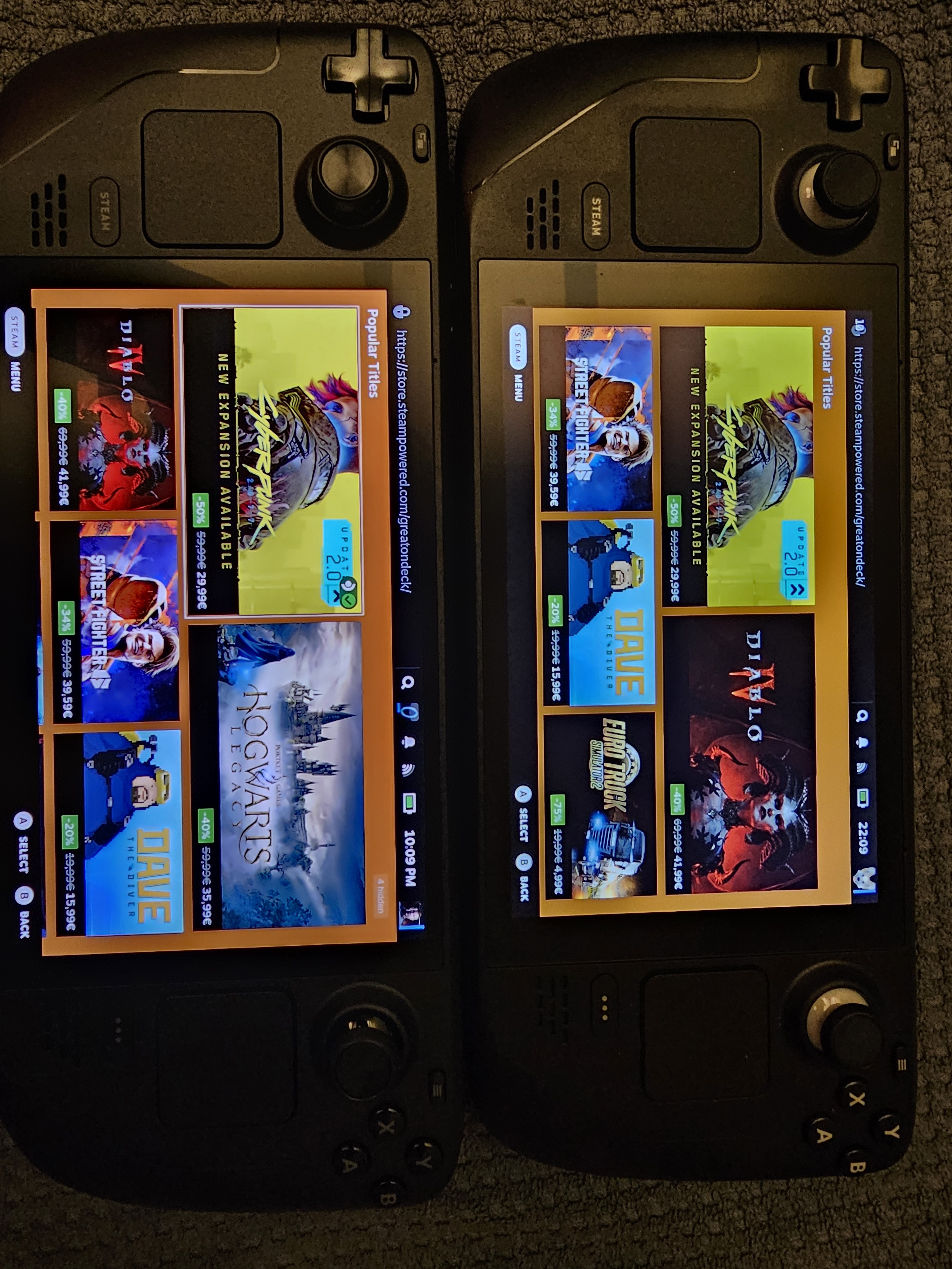
Nice! Is it weird that I prefer the more white details on the buttons instead of the new gray?
I'm with you. The white stands out more, adds a little flair to it. The grey just kinda blends in.
Of course, I'm the weirdo who gets attached to their controllers, so take that as you will.
Is it so you can see them while you play?
Yeah, a bit. I'm really bad at remembering Xbox-style controls since I only ever had Playstation as a kid/teen, so it's nice to be able to look and see at a glance which one is x and which one is y. It's mostly just a petty aesthetic thing, though. Not a deal-breaker, just a preference when looking at them side by side
Edit: looking at it again, I could see how it could potentially be an accessibility issue for people with poorer eyesight though?