this post was submitted on 06 Jul 2023
168 points (100.0% liked)
Lemmy Apps
5485 readers
143 users here now
A home for discussion of Lemmy apps and tools for all platforms.
RULES:
- No spamming
- Be nice and have fun
- Follow the general lemmy.world rules
An extensive list of Lemmy apps is available here:
Visit our partner Communities!
Lemmy Plugins and Userscripts is a great place to enhance the Lemmy browsing experience. !plugins@sh.itjust.works
Lemmy Integrations is a community about all integrations with the lemmy API. Bots, Scripts, New Apps, etc. !lemmy_integrations@lemmy.dbzer0.com
Lemmy Bots and Tools is a place to discuss and show off bots, tools, front ends, etc. you’re making that relate to lemmy. !lemmy_dev@programming.dev
Lemmy App Development is a place for Lemmy builders to chat about building apps, clients, tools and bots for the Lemmy platform. !lemmydev@lemm.ee
founded 1 year ago
MODERATORS
you are viewing a single comment's thread
view the rest of the comments
view the rest of the comments


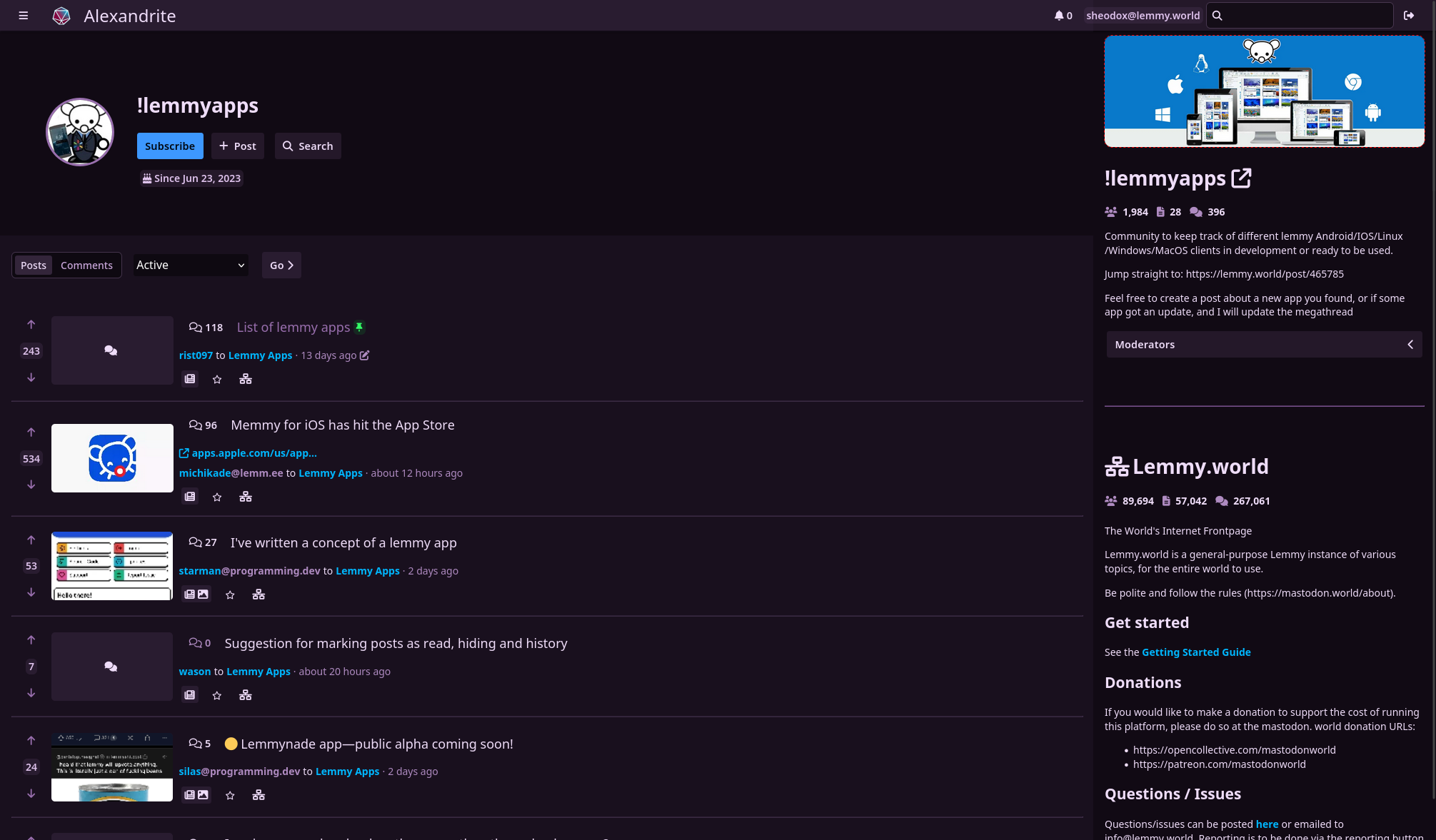
I love having alternative desktop-first interfaces! Really appreciate you putting the time in to make this.
A couple hopefully constructive thoughts:
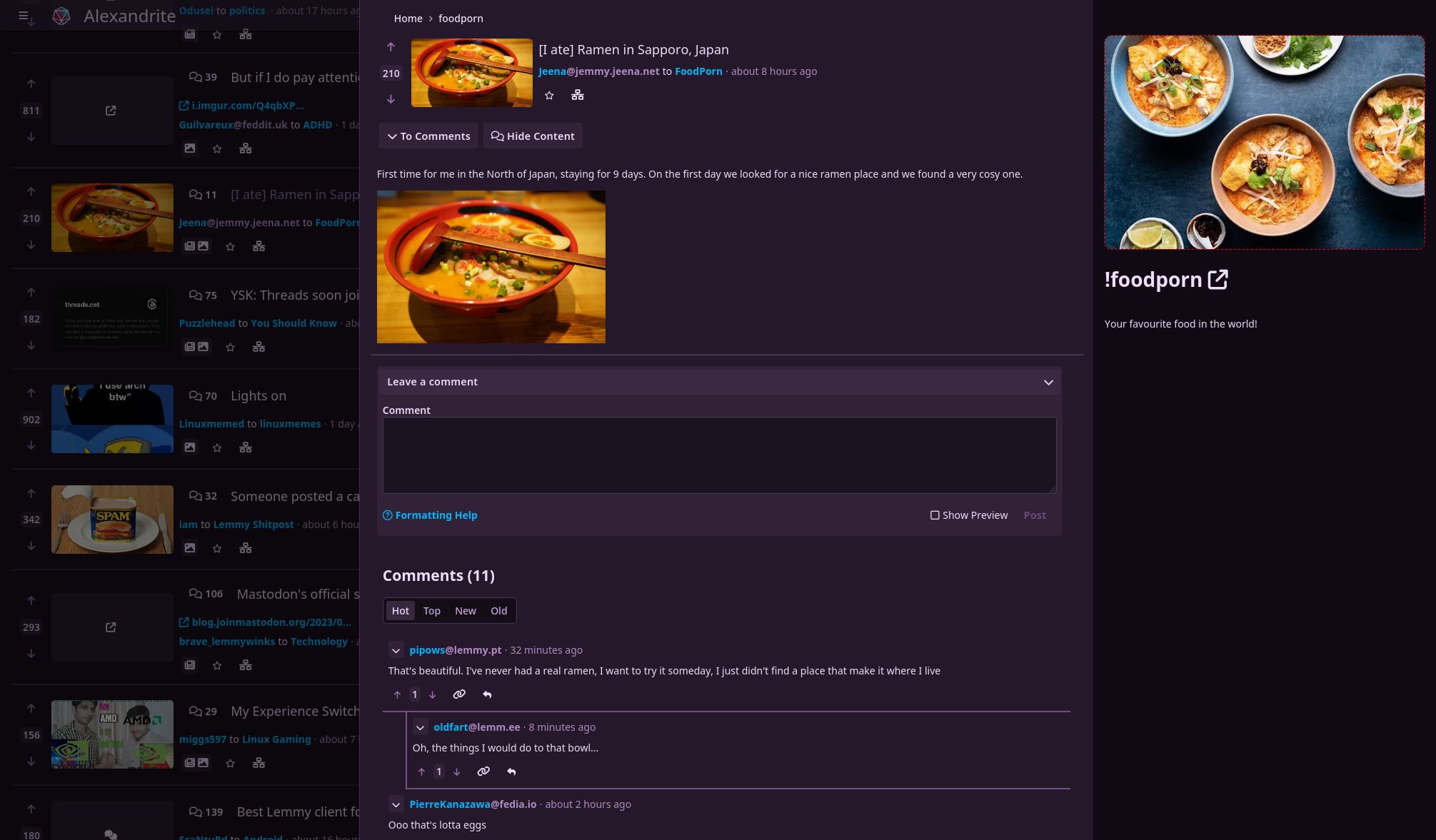
I find the text a little bit hard to read. It's like the text is lightly purple on top of being on a purple background. Maybe one gets used to this over time.
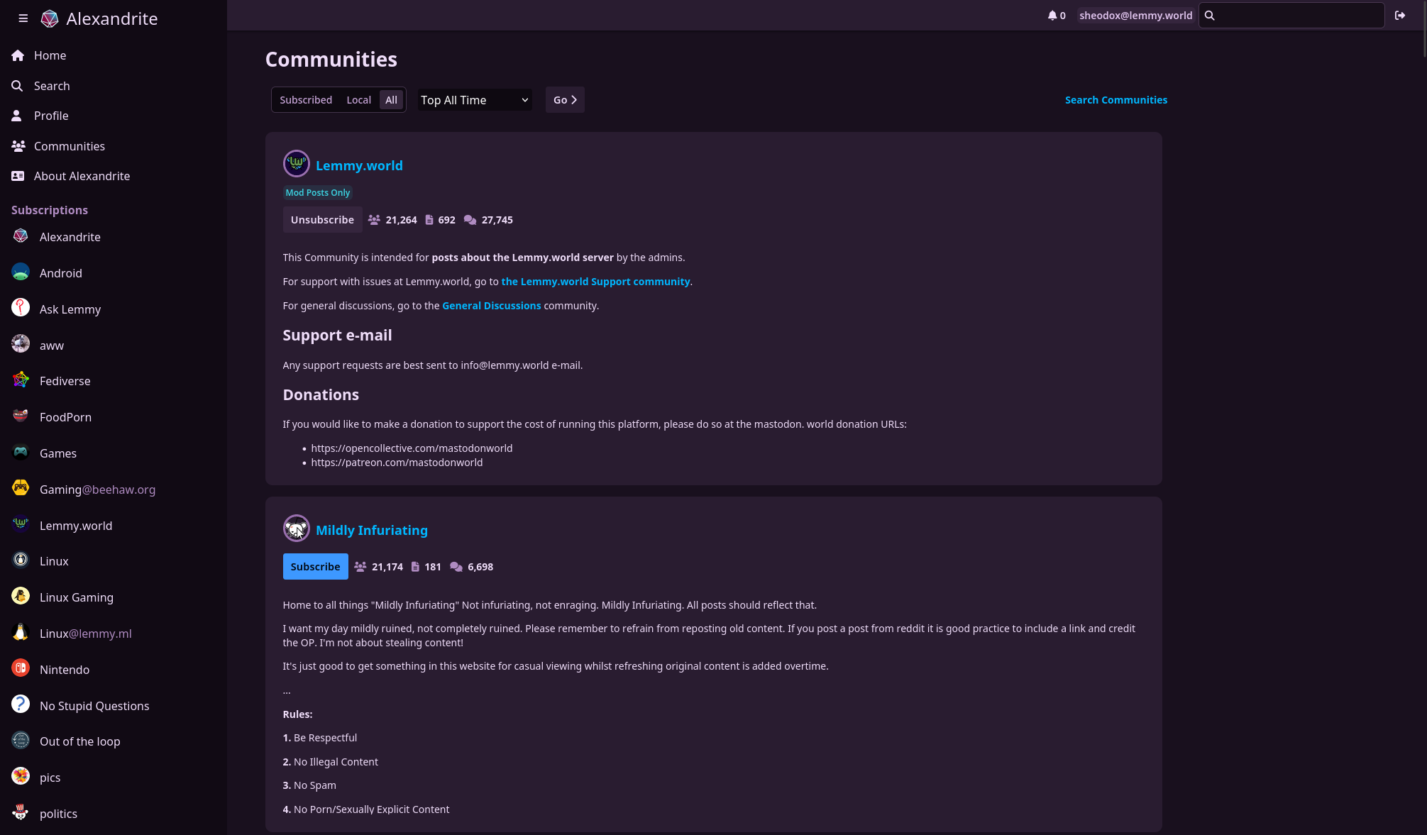
Why the decision to not show profile pictures and community icons without hovering over them? It makes it much easier for me to identify what community content is coming from at a glance when those are present.
There are now images next to users/communities on posts, let me know what you think.
Great improvement in my opinion, thanks for the quick turnaround!
Thanks!
Which text are you referring to? The normal text color is very slightly tinted purple but still has a pretty solid contrast ratio. Or are you talking about the text color on posts you've viewed already? I know certain kinds of screens don't render color very accurately, maybe I'll have to try it out on some other monitors around the house.
I thought having images big enough to recognize looked messy to me the way it's done on the official Lemmy UI (at least on 0.17.4) and I hadn't really tried making it look good. I know what you mean though, I might try showing the images (but at about the same height as the text) and see how that looks.