this post was submitted on 29 Oct 2023
235 points (100.0% liked)
196
16776 readers
2588 users here now
Be sure to follow the rule before you head out.
Rule: You must post before you leave.
founded 2 years ago
MODERATORS
you are viewing a single comment's thread
view the rest of the comments
view the rest of the comments

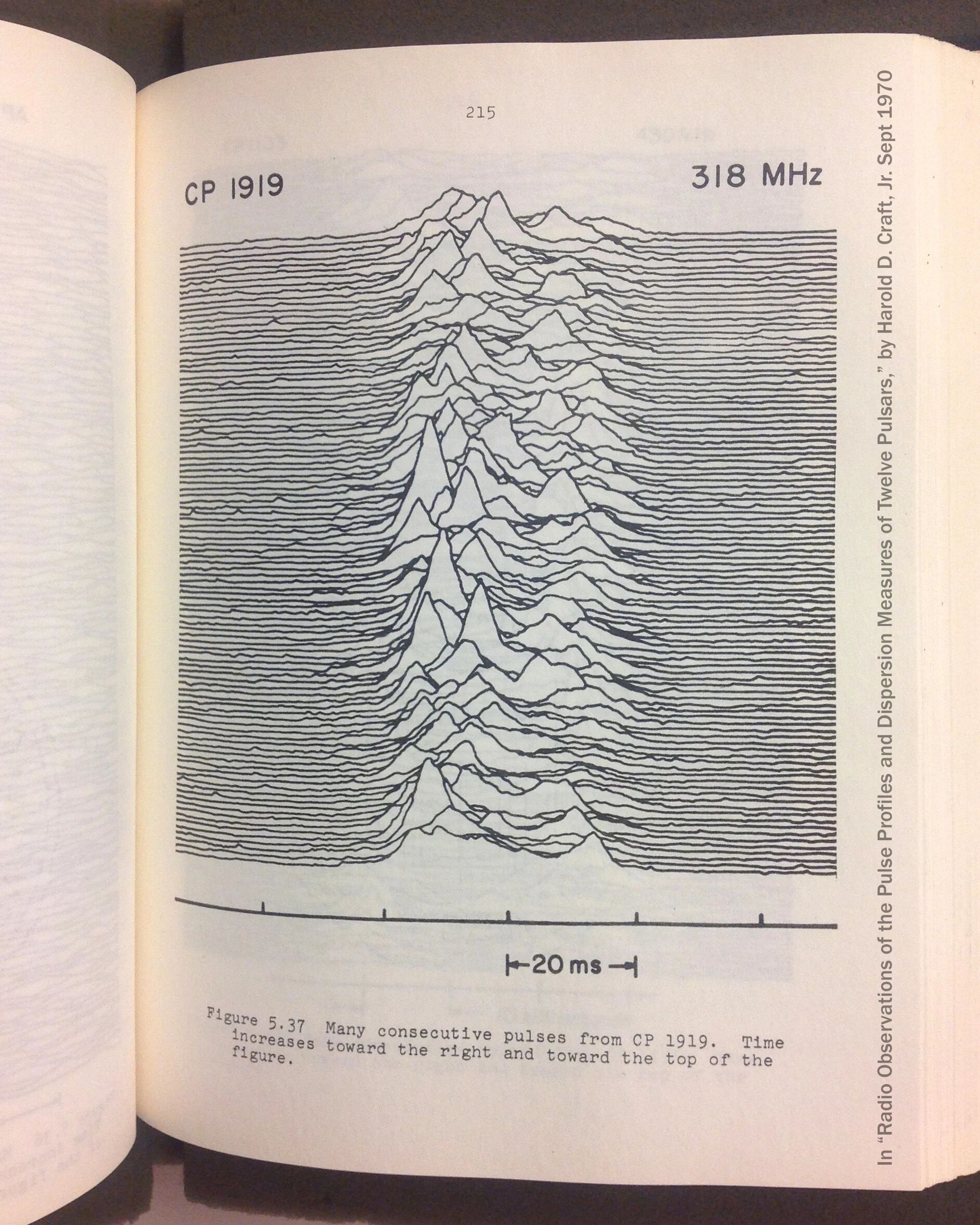
Like the other amigo said, it's detected emissions from a pulsar. For some more explanation, pulsars spin really fast and emit radio waves, think of it sorta like a lighthouse. So what the image is measuring is the intensity of the radio waves from this pulsar as it spins, with each period stacked in front of the last.
Visual aid from Wikipedia:
As you can see, this one has been simplified to demonstrate the concept, and the actual data is much more varied and interesting to look at; I do not know what causes the peak offsets and would also like an explanation
Yeah, that part is confusing because the description says
Which would mean the oldest pulse is in the foreground.
ahh you're right, I see, a little counter intuitive since going front-to-back would obscure newer data that wont be seen at all, while going back-to-front would only obscure older data