this post was submitted on 24 Aug 2023
67 points (94.7% liked)
KDE
5643 readers
105 users here now
KDE is an international technology team creating user-friendly free and open source software for desktop and portable computing. KDE’s software runs on GNU/Linux, BSD and other operating systems, including Windows.
Plasma 6 Bugs
If you encounter a bug, proceed to https://bugs.kde.org/, check whether it has been reported.
If it hasn't, report it yourself.
PLEASE THINK CAREFULLY BEFORE POSTING HERE.
Developers do not look for reports on social media, so they will not see it and all it does is clutter up the feed.
founded 2 years ago
MODERATORS
you are viewing a single comment's thread
view the rest of the comments
view the rest of the comments

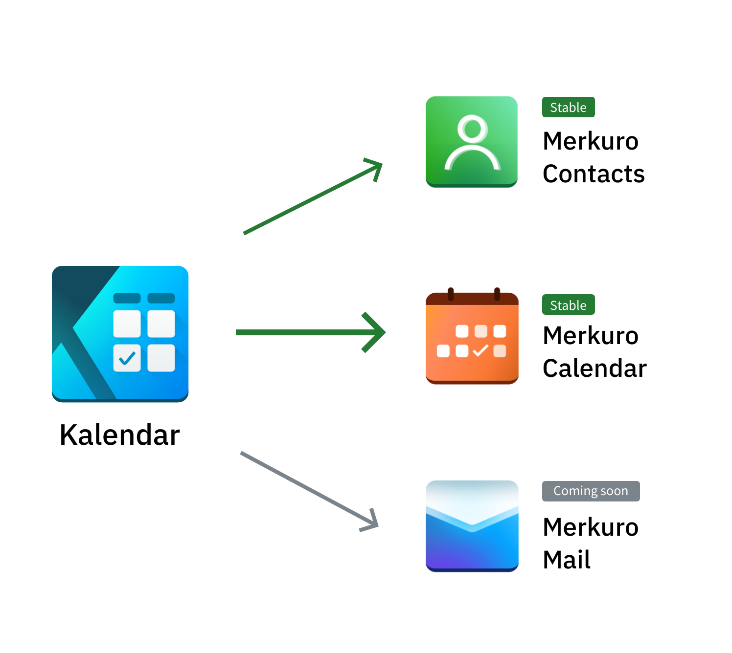
Some level of unification would be good. They are simply too different. I'd be more than glad to offer design help for free. The email icon looks too much like ProtonMail's. That is not OK.
Email icons are generic in general. Red M, Blue M, Purple M… Envelopes…
This email icon is a symmetrical blue/purple multicolor gradient with a shaded top. ProtonMail is an asymmetrical design in one color with varying levels of brightness and a blank top. The two look pretty distinct to me. Even without the different colors, the change in symmetry is quite obvious.
I do agree these don't have unity in their design though as a set, they look pretty generic.
I don't have a proton mail icon on my desktop though. I don't think that really matters. A consistency with the UI would be nice though. You could make an icon theme.