this post was submitted on 22 Jun 2023
76 points (100.0% liked)
Technology
37720 readers
542 users here now
A nice place to discuss rumors, happenings, innovations, and challenges in the technology sphere. We also welcome discussions on the intersections of technology and society. If it’s technological news or discussion of technology, it probably belongs here.
Remember the overriding ethos on Beehaw: Be(e) Nice. Each user you encounter here is a person, and should be treated with kindness (even if they’re wrong, or use a Linux distro you don’t like). Personal attacks will not be tolerated.
Subcommunities on Beehaw:
This community's icon was made by Aaron Schneider, under the CC-BY-NC-SA 4.0 license.
founded 2 years ago
MODERATORS
you are viewing a single comment's thread
view the rest of the comments
view the rest of the comments


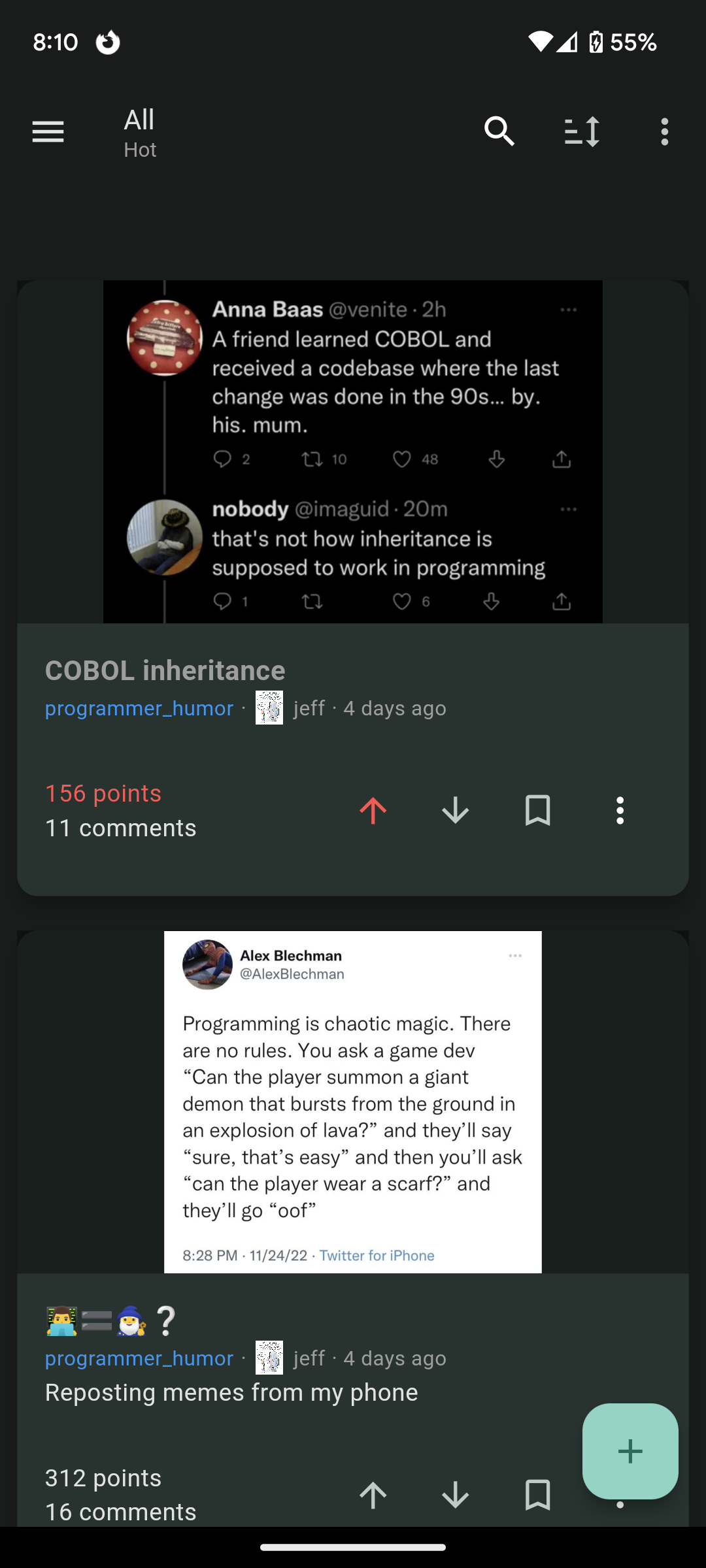
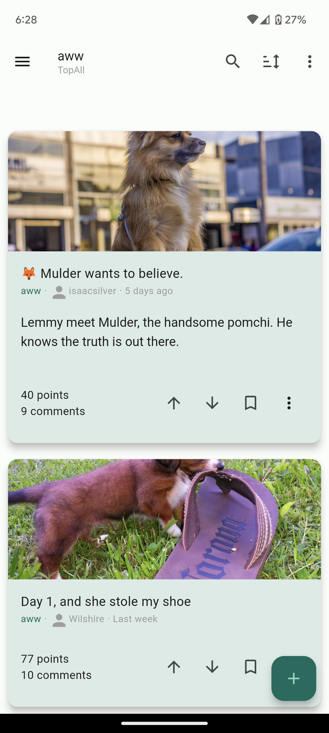
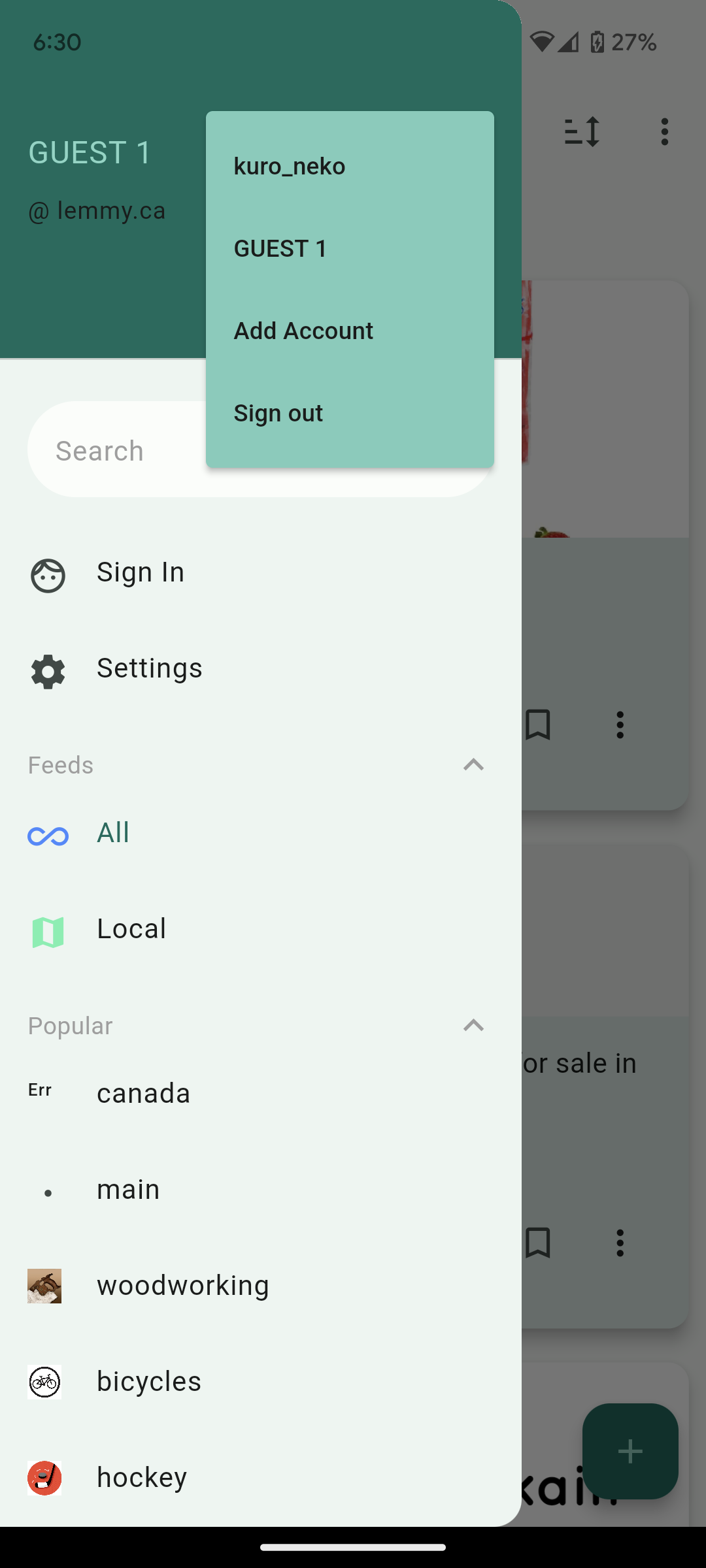
A good start! but the card view's background color is too bright, and honestly a lot of the space feels wasted. I know it's a really fine line between wasting space and having everything be too dense, but I think you erred too far towards having everything spread out -- contents are indented too far, cards are too big outside the borders of content, the space between UI elements is too large, stuff like that. Also, I can't see subscribed communities outside of my instance, which almost immediately made the app unusable for me. But with all those criticisms in mind, this app is the closest one I've seen so far to being a lemmy app I actively want to use, it's just not quite there yet imo. Good luck with your development!!