118
Keeping the aliens away
(lemmy.world)
General rules:
Exceptions may be made at the discretion of the mods.
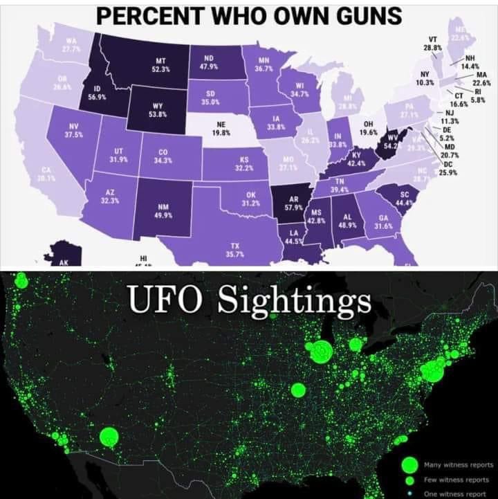
The top is the percentage of people while the bottom is the total incidence. This is an apples and oranges comparison. In this case the bottom map is functionally a population map as others have pointed out. Most stats are best in "#/thousand people" or equivalent, but should always in the same unit if compared.