Android
The new home of /r/Android on Lemmy and the Fediverse!
Android news, reviews, tips, and discussions about rooting, tutorials, and apps.
🔗Universal Link: !android@lemdro.id
💡Content Philosophy:
Content which benefits the community (news, rumours, and discussions) is generally allowed and is valued over content which benefits only the individual (technical questions, help buying/selling, rants, self-promotion, etc.) which will be removed if it's in violation of the rules.
Support, technical, or app related questions belong in: !askandroid@lemdro.id
For fresh communities, lemmy apps, and instance updates: !lemdroid@lemdro.id
📰Our communities below
Rules
-
Stay on topic: All posts should be related to the Android OS or ecosystem.
-
No support questions, recommendation requests, rants, or bug reports: Posts must benefit the community rather than the individual. Please post to !askandroid@lemdro.id.
-
Describe images/videos, no memes: Please include a text description when sharing images or videos. Post memes to !androidmemes@lemdro.id.
-
No self-promotion spam: Active community members can post their apps if they answer any questions in the comments. Please do not post links to your own website, YouTube, blog content, or communities.
-
No reposts or rehosted content: Share only the original source of an article, unless it's not available in English or requires logging in (like Twitter). Avoid reposting the same topic from other sources.
-
No editorializing titles: You can add the author or website's name if helpful, but keep article titles unchanged.
-
No piracy or unverified APKs: Do not share links or direct people to pirated content or unverified APKs, which may contain malicious code.
-
No unauthorized polls, bots, or giveaways: Do not create polls, use bots, or organize giveaways without first contacting mods for approval.
-
No offensive or low-effort content: Don't post offensive or unhelpful content. Keep it civil and friendly!
-
No affiliate links: Posting affiliate links is not allowed.
Quick Links
Our Communities
- !askandroid@lemdro.id
- !androidmemes@lemdro.id
- !techkit@lemdro.id
- !google@lemdro.id
- !nothing@lemdro.id
- !googlepixel@lemdro.id
- !xiaomi@lemdro.id
- !sony@lemdro.id
- !samsung@lemdro.id
- !galaxywatch@lemdro.id
- !oneplus@lemdro.id
- !motorola@lemdro.id
- !meta@lemdro.id
- !apple@lemdro.id
- !microsoft@lemdro.id
- !chatgpt@lemdro.id
- !bing@lemdro.id
- !reddit@lemdro.id
Lemmy App List
Chat and More
view the rest of the comments

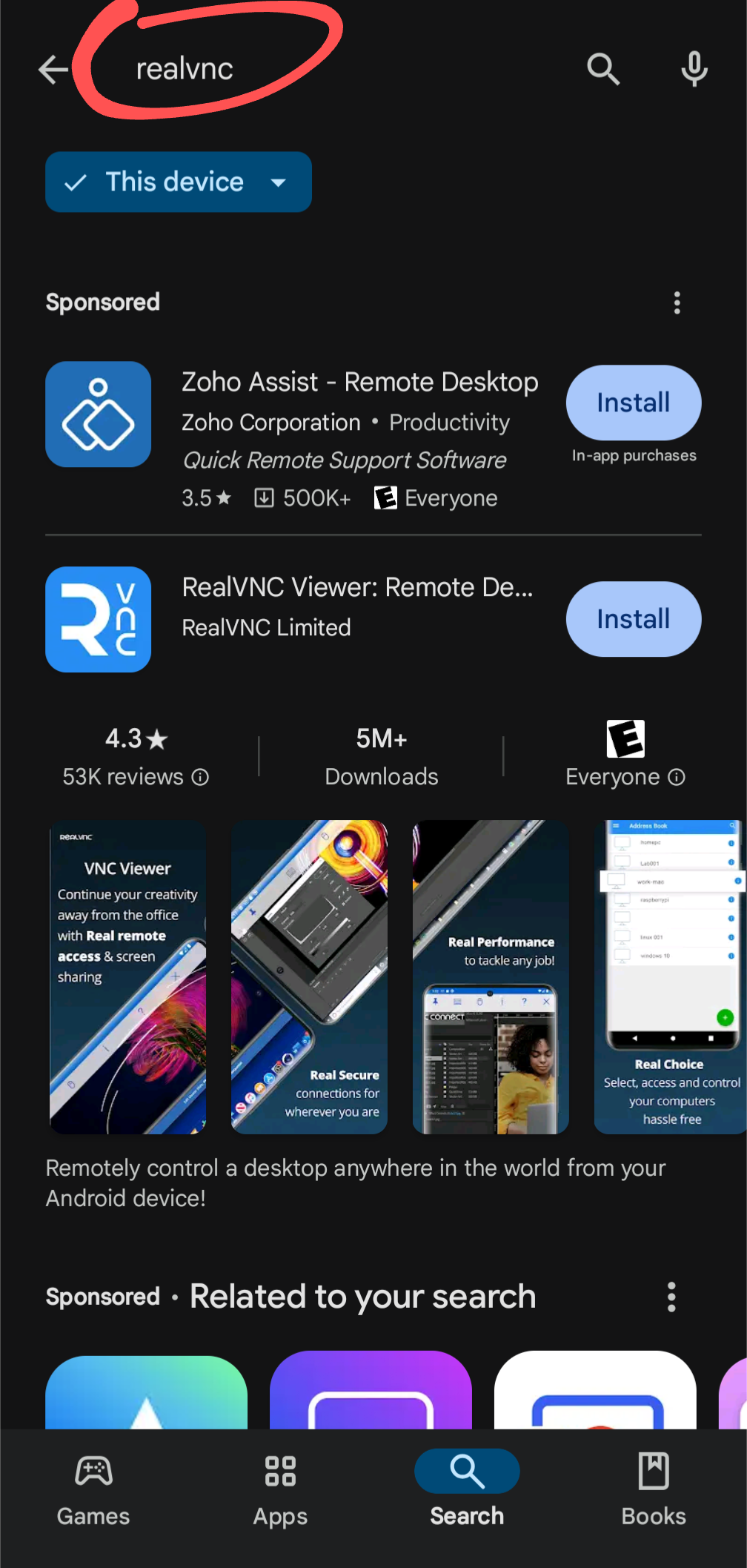
Now squint just a bit. That's how everyone without perfect vision sees it, and that's a huge proportion of people.
Also, this is how other results appear:
No Install buttons.
E: Not sure why this image doesn't show but in any case, app results in lists don't have Install buttons. Hm apparently it only doesn't show on mobile.
Removing the Install button from the ad would eliminate this issue in most cases. There, I fixed stupid. I've done UX btw, some of it on Android.
I aimed to make it more difficult to install the advertised app by accident, which was the original problem. You seem to agree that my design change would achieve that. 😂
Everyone here knows everything you said. I'm merely providing a current example of where things are today and I'm making a moral judgement that this design has become too counterproductive for the user. Not sure if you stand on the other side of this and if you do, that's fine. You may have your reasons to support Alphabet's corporate interest. I don't in this case. Therefore I feel it's justified to make things less productive for Alphabet. You suggested nothing can be done other than removing the ad altogether. I suggested a way to solve the issue I highlighted without removing the ad.
Assume it's not disingenuous. Instead picture observing a user confusing the two and draw a conclusion other than they're an idiot. But you already said you understand this design makes users more likely to click on the ad. Do I have to explain the common elements of the layouts in a wireframe? Do I have to go into the differences in noticeability between more and less prominent design language elements in order to explain in what way they're identical? Come on, cut some slack and assume better.
The screenshot you are showing is scrolled down the page past "More results". What you are showing is after all of the actual search results (which for me is just the app and no ad).
As someone who's seeing this Play Store search result page for the first time, I also find it massively confusing.
Frankly, it looks like just the description page of RealVNC with an info box for "Zoho Assist" at the top (which might be the team that develops RealVNC?), and for some reason there's also two install-buttons.
You don't have a chance to realize that it's a list of search results, because there's practically no repeating UI elements.
Aside from the sponsored app at the top (which I also don't find clearly labeled; that "Sponsored" could just be a generic heading above everything), I don't even assume malicious intent from Google here.
Presumably, they made the RealVNC entry big, because they don't want you falling for scam apps. But it is absolutely not helpful in this case.