this post was submitted on 23 Aug 2023
37 points (93.0% liked)

Gnome

1916 readers
8 users here now

The GNOME Project is a free and open source desktop and computing platform for open platforms like Linux that strives to be an easy and elegant way to use your computer. GNOME software is developed openly and ethically by both individual contributors and corporate partners, and is distributed under the GNU General Public License.

founded 1 year ago
MODERATORS
 

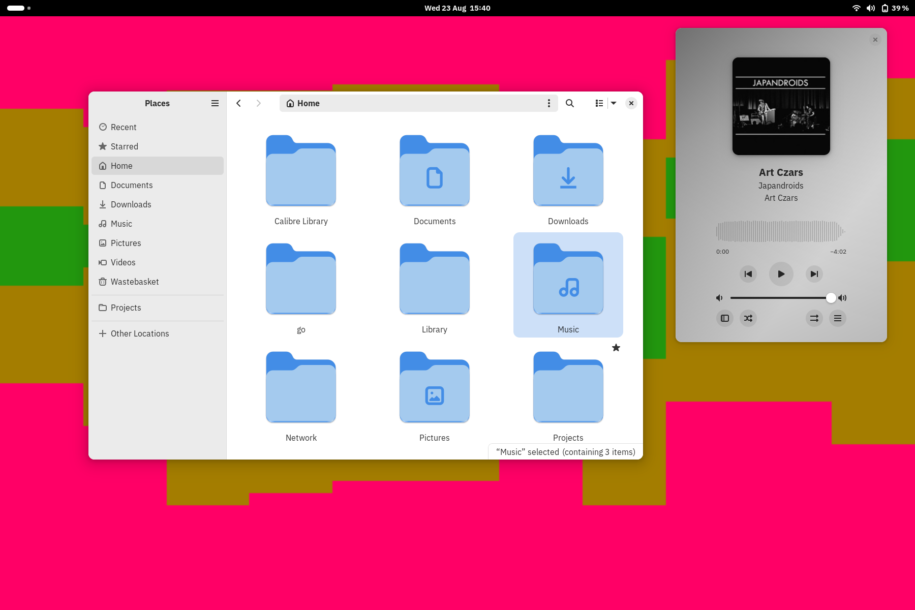
I quite like it, built on Debian sid.

top 5 comments
sorted by: hot top controversial new old
[–] aka_oscar@beehaw.org 5 points 1 year ago* (last edited 1 year ago)

I like it too. Checked it out on the nightly flatpak build. Gotta say its unusual to have the hamburger menu on the left instead of the right, but its one of those things you get used to.

~~I also hope the leftmost corner gets to have a button, since it looks too empty there. Ive read theyre considering adding a "global search" button~~ Testing it, ive realized thats where the "copy/moving files to..." circle thingy shows up.

I also noticed when shrinking the window's width the sidebar collapses way sooner than before. This is bc of the search bar not using the whole headerbar anymore, so it collapses the sidebar in order to maximize search bar width
[–] DmMacniel@feddit.de 4 points 1 year ago

That new sidebar looks nice.

[–] pizzaiolo@slrpnk.net 1 points 1 year ago (1 children)

The icons are huge. I hope that's not the default...

[–] Iamnotyourbroom@lemmy.ml 1 points 1 year ago

nah, i normally use list view this is a pretty big icon size...

[–] Iamnotyourbroom@lemmy.ml 1 points 1 year ago

The search button pops up there at times, not sure exactly when, but without it it looks a bit barren. I'd really like the 'collapse' point to be configurable in gtkrc or something, I still feel like it could collapse earlier maybe? Preferences doesn't really need a primary position as it not something you'd be getting into everyday, I'm fine with it in that slightly odd spot. I haven't tried how it works if you swap button sides, I remember amberol puts them within the headerbar still, which would be weird.