Hah mine has recently stopped working well and I been looking for a replacement. Should I just get the same one?
Mildly Interesting
This is for strictly mildly interesting material. If it's too interesting, it doesn't belong. If it's not interesting, it doesn't belong.
This is obviously an objective criteria, so the mods are always right. Or maybe mildly right? Ahh.. what do we know?
Just post some stuff and don't spam.
I've stuck with M705 for many years. It's simple, but has a button on top that lets you swap the mouse wheel from free floating (you can spin it and it spins, very useful for scrolling through long text like logs or code quickly) to the usual click type scrolling.
This is my favorite feature on the MX Master mouse, hands down
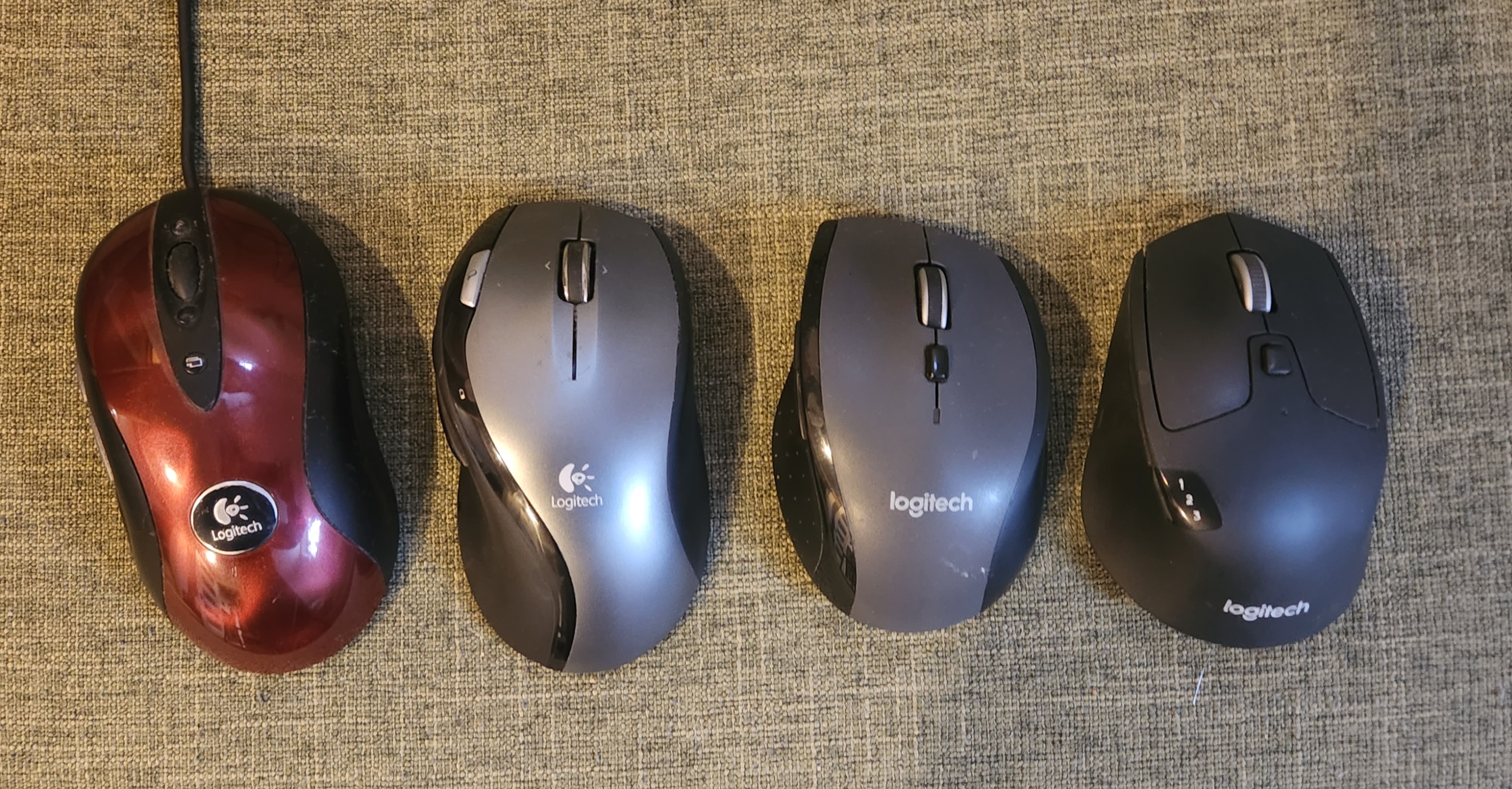
I got all inspired by this post, and took a shot of some of the Logitech mice I have around here.

The red one (MX510) seemed so sleek and advanced in its day, and now is...large. And lumpy. And the logo is actually attached.
The M720 is the best of them. I wish they'd update it.
been using m720 for over 2 years. absolutely love this mouse for the price point
I will admit their old Some Seeing Eye logo thing doesn't screen print well, and it does have a bit of Windows Vista feel to it, kinda not helped by that gloss coating.
What is that nonsense on the right?
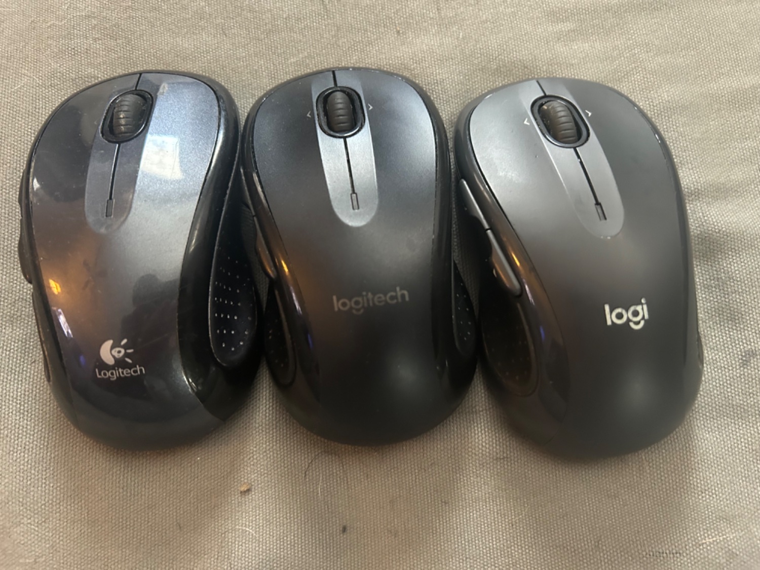
That’s funny I have the same mouse as you and just bought the newest one. I just don’t have the middle one like you have here.
It was actually a good thing I bought the upgrade. The old mouse on the very far left is barely responsive compared to the new one on the far right. they also developed the software for it to react a lot better. It’s also a lot quieter. Even on the side buttons. and the grip is better as it’s not so shiney to shoot out from under the hand.
I have a trackman marble with the old logitech logo. Nostalgia
While I love Logitech I'll never forgive them to have killed the Harmony products, it's so great I can't believe they took that decision
It's interesting how minimalist design also influence the hardware design. Like how glossy the first gen compared the latest gen with matte color.
