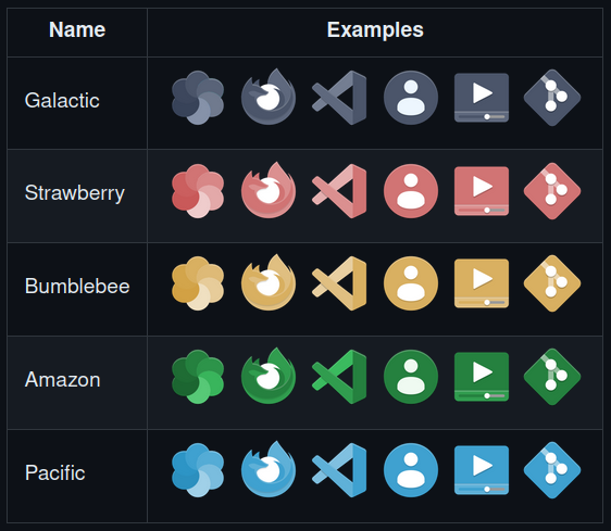
Looks better, but every time I tried it it didn't work for me so much. I noticed that I associate an app with its color, and that it's easier for me to look for something orange when I'm looking for Firefox than just the shape of the logo. This is one of the reasons why I hate Google Icon designs which basically use the same colors in their designs. Might look more aesthetical, but for me at least it is less practical.
this post was submitted on 19 Jul 2023
128 points (97.8% liked)
Unixporn
15406 readers
16 users here now
Unixporn
Submit screenshots of all your *NIX desktops, themes, and nifty configurations, or submit anything else that will make themers happy. Maybe a server running on an Amiga, or a Thinkpad signed by Bjarne Stroustrup? Show the world how pretty your computer can be!
Rules
- Post On-Topic
- No Defaults
- Busy Screenshots
- Use High-Quality Images
- Include a Details Comment
- No NSFW
- No Racism or use of racist terms
founded 5 years ago
MODERATORS
I get it. This is just a step towards being able to recolor icons in whatever color scheme you'd like, multicolored included.
Recoloring icons on the fly sounds super interesting 🤔
Will this apply to your minimal Linux Mint OS? (Took a glance at the repo name and your profile)
Yes, it will :)
view more: next ›
