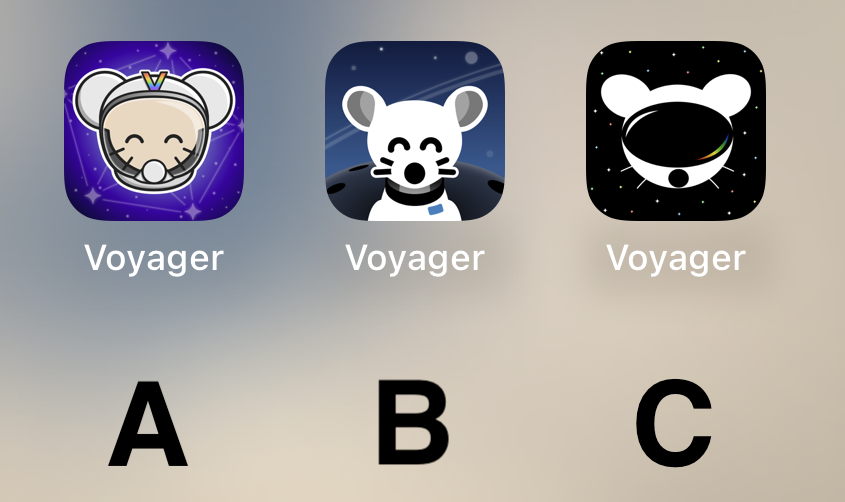
Quick comparison on Android (custom launcher): https://i.ibb.co/XVnM2NL/comp.png
Voyager
The official lemmy community for Voyager, an open source, mobile-first client for lemmy.
Rules
- Be nice.
- lemmy.world instance policy
Sponsor development! 👇
💙
B with the helmet of A (minus the “V”)
I can't decide between A and C... I am gonna go for C I guess.
BTW can we have different icons like Apollo had?
I liked C best at first glance, but after looking at the screenshots my choice is A.
B, good middle ground of clean design yet still has personality
C
I prefer what we already have but if we have to change then go with A
B Please! Looks so very clean.
B
Initially I liked the background on A and the lemmy on B....
....but I think C has my vote just for the sheer symbolism it projects - a confident lemmy ready to boldly venture into the future fediverse.
C
I like A a lot, reminds me of the early iPhone days of tasteful skeumorphism.
B is probably my favorite tho -- definitely the cleanest.
C looks off to me, something about the goggles.
C
Definitely A.
B is kinda creepy and C looks like a VR app.
I like Option B the most
C Simple and cool but gets the point across.
Voted for A, it’s definitely the cutest and I like the rainbow “V”. B has a nice background, though. C I think could do with better defining the shape of the head to look more like a helmet and less like a mouse wearing a VR headset :) Great job to all the applicants!
A or C
B looks best for me
I'd go with A! I like the presentation of B better but the little guy reminds me of Chuck E. Cheese or fnaf. Character in A is adorable :)
I liked C too but it kinda looks like the Reddit guy in VR goggles.
I really like A, feels very professional
B but with the helmet and head of A would have been amazing. A looks to shiny rn.
I vote B.
C
C is very sleek!
B, although I do like the community icon, it would be interesting to see the background of the community icon as the background of the three options. (poll doesn't let you vote if you use a perma incognito browser) edit: changed my vote :)
A
C
Can we have them all and a setting to choose? Other apps do that. Is it a limitation of the PWA?
I really like B!
C for sure
Loving the C image design, it looks great
A
I was hoping for a more rainbow theme! This will be a tough decision.
C
I made a shortcut that lets you change web app icons on iOS, so if you either want to try out the icons or actually use a different icon (maybe one of the other great ones that haven’t made it to the final vote). Here it is: Shortcut link
Can you add support for themed icons?
https://proandroiddev.com/implement-themed-icons-android-13-d20b89233681
All the other Lemmy apps I tested have themed icons. Be nice to have the same with the only Lemmy app I use 😁
I want them all! They all look fabulous!
B
I like the current one but I voted for A if you have to change it. It looked the best on the desktop.
B by far


