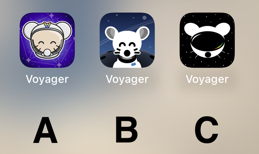
I don't like any of them. That said, I voted for C. It's kinda plain, but that's what I like about it. The other ones are too messy.
Voyager
The official lemmy community for Voyager, an open source, mobile-first client for lemmy.
Rules
- Be nice.
- lemmy.world instance policy
Sponsor development! 👇
💙
B
B!! :D
A, hands down
B
B
B by a large margin.
B. A is also good. Don't like C at all.
B
C
C mouse with A background please
All are very good, but B takes the cake for me personally.
It’s really cool to have such talent in this community to go along with such an amazing app. The 3 finalists are really good. I don’t usually use dark icons but I love C so much. I hope to see variations of it as the app grows. Congratulations to all who made it to the top 3! That in itself is an accomplishment. I can’t wait to see the results of the final! This community is awesome!
B my lord
C
I like the idea of A, but as a Designer, B’s execution is way better and cleaner. Cohesive style, and very fitting for iOS. Sad that A is too cartoony. C is weird, the mouse is flat, and the “visor” (that looks like a huge mouth) is very detailed… don’t like it.
So, B, definitely.
C looks like Daft Punk mouse
Definitely B
Voted C. It's by far the most robust option. It looks stylish, professional, and could easily accommodate a flat, 1-color design.
B 100% !!! It's so cute
🅱️
Really like A! Good job to all participants though!
A and B has too many details for an app icon that isn’t for a game.
Definitely B
B gang
I’m just here to say: CHARGE YOUR PHONE!
Also, C A B is my ordered preference.
I like the background of B the best. But it looks more like a dog and it's throwing me off. I like the character of the first one better, especially with the V on the helmet.
So I think I'm voting for A
C
I will be happy with either b or c
A looks like something an elementary school aged kid would have on their iPad for help learning to add.
B's got my vote.
B, but the planet in the background makes it look like extremely large shoulders.
I like B the best.
C
i vote for B cuz i think it's the cutest 🐭
Why I chose "B": It's clean and professional-looking. "A" looks a bit complex in comparison, and "C" doesn't look much like a lemming.


