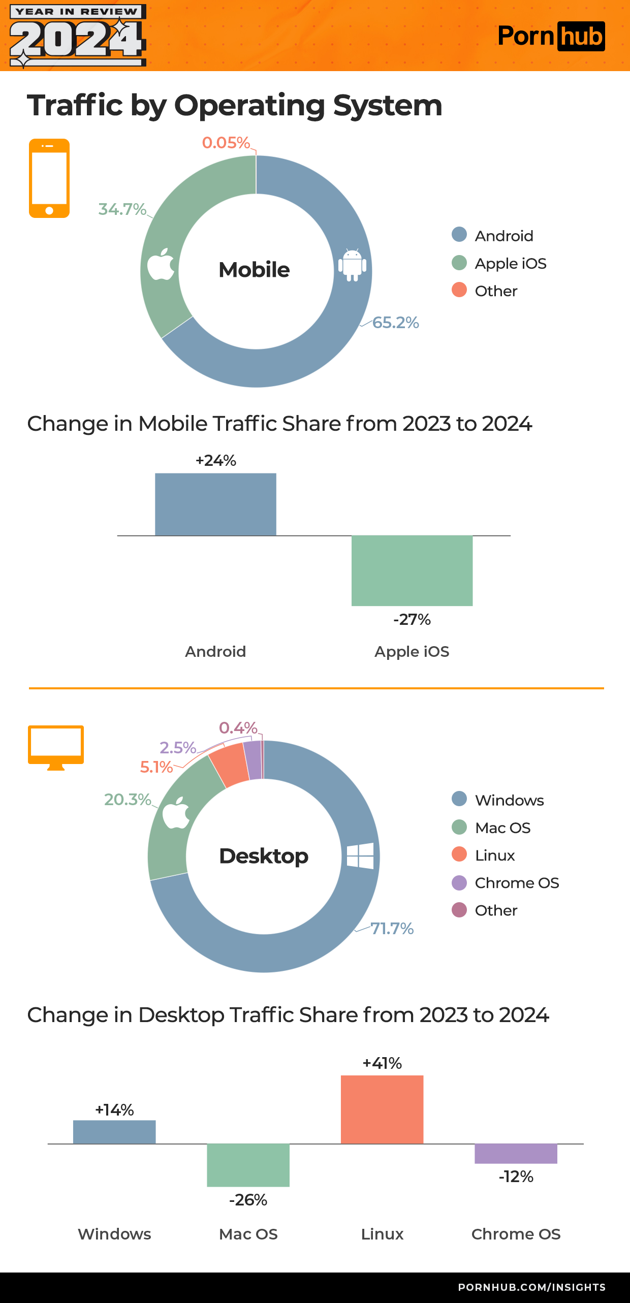
I don't like how the bar graphs, obviously supposed to show percentage points, actually show relative percent change.
Data is Beautiful
Be respectful
What graph works better to show relative percentage change?
Bar graph of absolute percentages before & after overlaid. For example, a darker outline rectangle for 2023 and a lighter filled rectangle for 2024. Or just two rectangles next to each other, as lots of business charts do.
So it would still be a bar graph. I thought your argument was that it wasn't the right type of graph for this dataset, not that you disagreed with the dataset used in the first place. I agree that the one you proposed is easier to understood, but I don't really agree that using it like they did is improper. It is certainly useful if you want to save space.
Let's say 2 people used TempleOS, Symbian, MS-DOS or some other extremely weird thing to load the website in 2023 and then 42 in 2024 because it gets referenced in a porn video or something. The relative increase bar of 2000% would dwarf the changes in major OSs' usage even though the absolute number is miniscule in comparison. Yes, they get lumped into "other" but this kind of discrepancy is already happening with the somewhat exaggerated Linux increase: Windows actually gained 3x more users than Linux did in absolute terms but the Linux bar is 3x bigger.
0,4% of desktop users come form Solaris?
0.0002% come from Plan 9, somehow.
Vrooom go OSS!
Haha hello anon
Now adjust it for total market share of the OSs and you'll arrive at the conclusion, everybody wanks equally.
Conclusion: People with linux fuck.
Sometimes, occasionally, even other people.
According to statcounter WE are currently at 4.03% market share.
Sorry, I think extra 1% is me rubbing more than one out a day.
I'm curious about mobile vs desktop.
Yeah. I suspect most of the desktop platforms are shrinking. Maybe even all of them.
Pornhub wrapped, haha. I do appreciate the stats, though.
Forget grow by 0.5, we need to grow by 1.8%!
