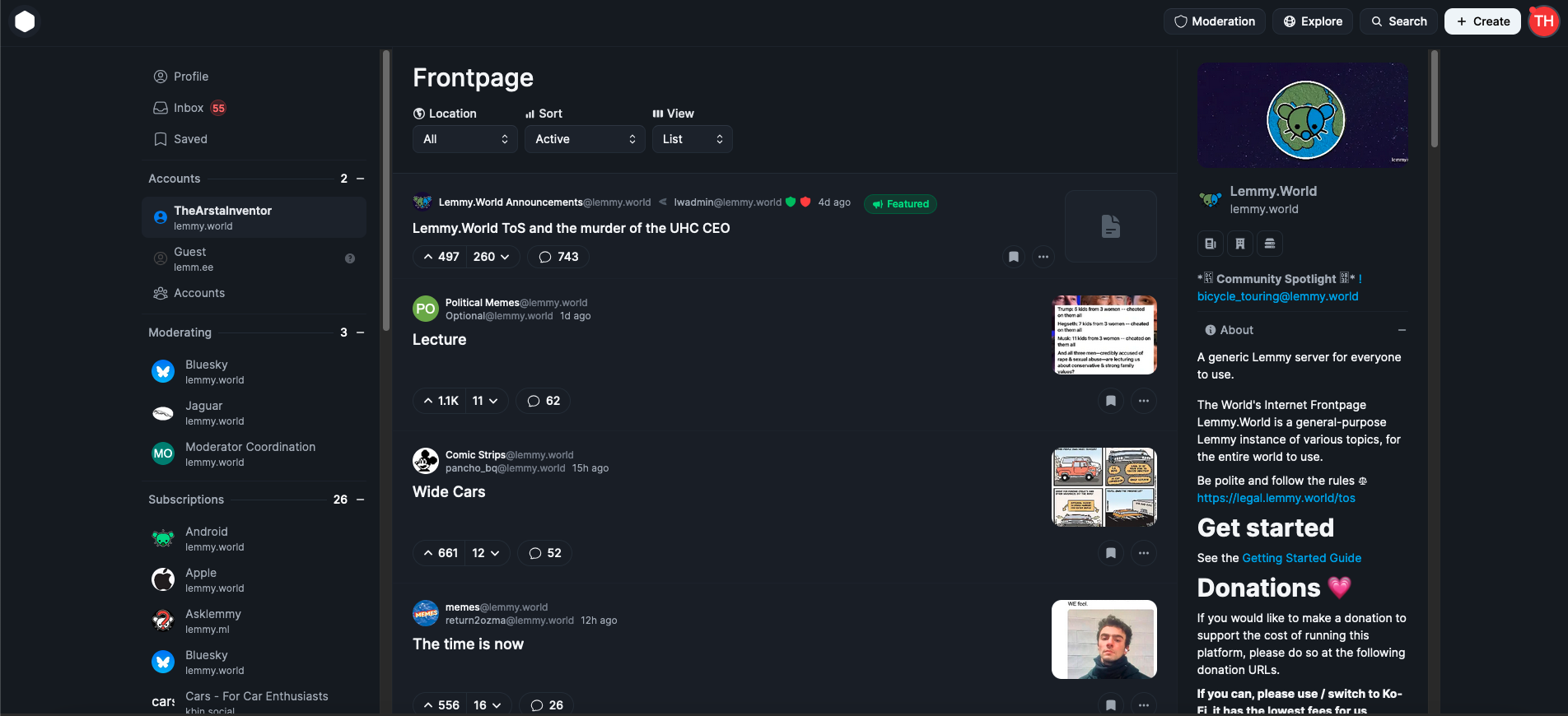
As a strong supporter of open-source and community-funded projects like Lemmy, which prioritize serving users over investors, I believe Lemmy has significant potential, and that's why I am here. However, it is clear that its growth is nearing a plateau in its current form. Despite the surge in users following Reddit's API changes, Lemmy continues to primarily attract tech-savvy individuals, politically left-aligned users, and those accustomed to old Reddit. For Lemmy to reach the broader average general audience, meaningful changes are necessary.
The rise of Bluesky demonstrates the importance of ease of use and a user-friendly design. Its polished and familiar interface is a key reason for its growth and appeal as an alternative to platforms like X/Twitter. This same ease of use is what Mastodon lacked, leading to its initial hype fading quickly. The average user is unlikely to adapt to something that feels complicated or unfamiliar, and this challenge also applies to Lemmy.
As someone who started as an average Reddit user and became more tech-savvy over time, I can confidently say that first impressions matter. When users first visit lemmy.world, the default UI is often enough to discourage them from staying. Most will not explore the homepage sidebar to explore, figure out and switch to one of the alternative UIs available, which is unfortunate because a better UI could make a huge difference.
This is why I propose that large servers like lemmy.world adopt Photon UI as the default web interface. Photon is currently the best and most mature alternative UI, offering a visually appealing, modular design that feels familiar to users of new Reddit. It makes excellent use of screen space and provides customization options like compact and cozy views. Unlike some other alternative UIs, Photon is actively maintained and ready for widespread use, although in no way is it perfect, this can also help bring in more contributors to the project development.
While it is important to continue offering other UIs as options, I believe adopting Photon as the default UI could make Lemmy far more appealing to the average Reddit user. First impressions are crucial, and the current default UI has turned off many potential users. If we want Lemmy to succeed as a true Reddit alternative, we need to prioritize user experience and accessibility. Thankfully today, Lemmy still continues to be THE biggest Reddit alternative, while our userbase is still considerably smaller than Reddit, it's the biggest of any alternatives, and Lemmy continues to somewhat be in the spotlight for those seeking alternatives, we can't let growth stagnate, it's high time we make the platform more welcoming and appealing for the average joe.
EDIT: The image I attached is from photon.lemmy.world, which I just realized is using the outdated version of Photon, I have updated the image to the updated current photon version from phtn.app. There are a lot of improvements made.

Hi everyone, I'm the dev. Reading all these comments really hurts when it's something you've poured your heart and soul into for over a year.
There's reasons I do everything I do in this UI, and my primary goal is to make Lemmy accessible for everyone.
This is the "cozy" view as well, but there's a "compact" view for people like me who enjoy more information density. Again, my end goal is to make Lemmy accessible. I don't do this for the sidebars for convoluted reasons I won't get into.
I'm not the one trying to advertise it, and I've never really tried to because of the fear of disapproval. I think I should advertise it myself now because then I can showcase the best parts and not get misunderstood. This screenshot uses the "list" view, imo the worst one, with some cursed chrome scrollbars.
Now that I see that the majority of users believe this sucks, I'm not sure if my mission is worth it or if I'm even doing it right.
I'm probably being too sensitive to criticism which I should expect from any project. But this project is the only one I used to feel proud of, then people chiming in claiming it's the ugliest thing they've seen. I don't know im blind to design which is the only thing I considered myself "good" at in terms of web dev.
Photon is amazing, and I use it daily. I love it. I'm sorry about the users in the comments that don't understand what "subjective" means.
Thank you for all your work, and keep doing what you're doing!